Blog
Nail inspo for Summer 2026: Fresh, Playful & Trending Manicure Ideas You’ll Want to Try
Summer always shifts my perspective in the most subtle ways. I start editing everything—what I wear, what I carry, even the small details like how my nails look when I’m holding a cold drink in the heat. There’s something about brighter days and constant movement that makes these details feel more visible, more intentional.
And nails, for me, become part of that shift. Not just an accessory, but a finishing touch that pulls everything together. The question isn’t just what’s trending for summer 2026 nail inspo, it’s what actually feels aligned with the moment. Do we lean into softness and simplicity, or do we explore color, texture, and something more expressive?
This season, I’m noticing it’s less about choosing one direction and more about balance. Some days call for clean, understated finishes, while others invite a bit more creativity. And that’s really the point—these designs aren’t just about appearance, they reflect how you want to feel.
Soft Sky Blue with Minimal Botanical Accent
I find myself reaching for this kind of palette whenever I want something that feels fresh but still intentional. A soft, airy blue across most nails creates a clean base, while a single accent with fine botanical detailing keeps it from feeling too safe. It’s subtle, but there’s personality in the contrast.
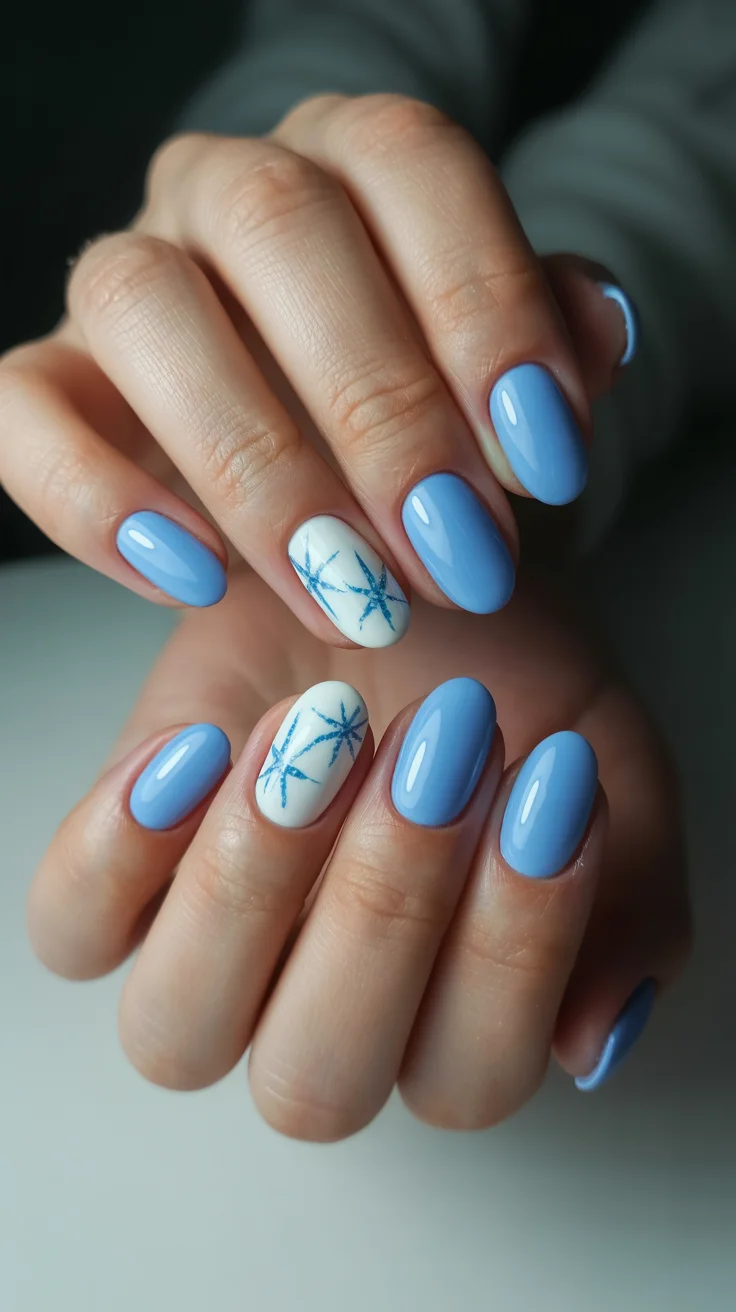
When I recreate this in the studio, I focus heavily on balance. The blue needs to stay slightly muted, not overly bright, and the artwork should feel almost effortless. I usually build the color in thin layers and take my time with the detailing, because this is the kind of look where precision quietly elevates everything.
For me, this works best during slower weeks when I want my overall style to feel reset and uncluttered. It’s calm, but not forgettable.
Glossy Lilac Almond for Effortless Summer Calm
There’s a quiet confidence in a lilac manicure done right. No extra elements, no distractions—just a creamy tone paired with a perfectly shaped almond nail. It feels soft, but still polished enough to carry a full look.
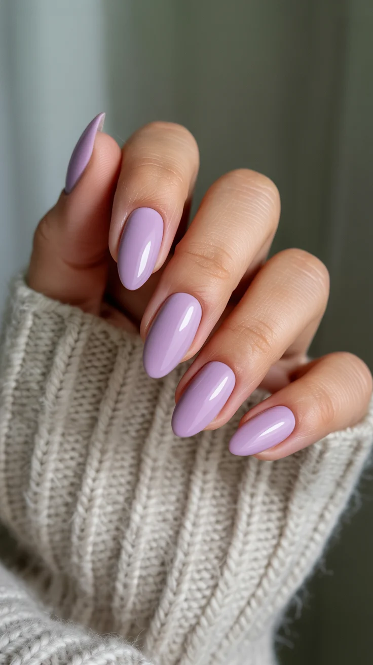
In my experience, the shape does most of the work here. If the structure isn’t right, the simplicity falls flat. I always refine the edges carefully before applying color, then finish with a high-shine top coat to give that almost glass-like effect.
I lean toward this when I want something low-maintenance visually but still refined. It’s one of those styles that blends into everything while still feeling complete.
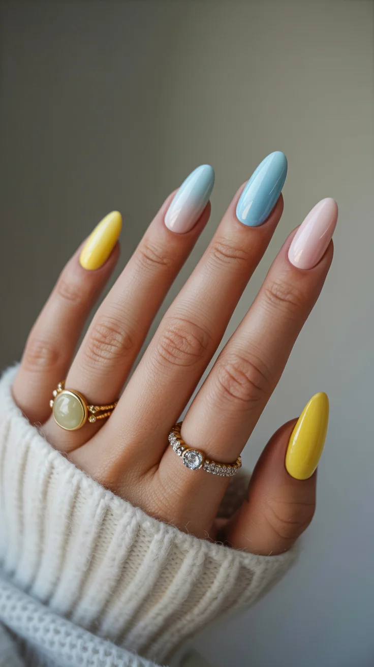
Playful Citrus Pop with Graphic Lemon Art
This is where things start to feel more expressive. Bright yellow paired with a neutral base instantly shifts the mood, and adding graphic fruit details gives it that playful, almost editorial edge.
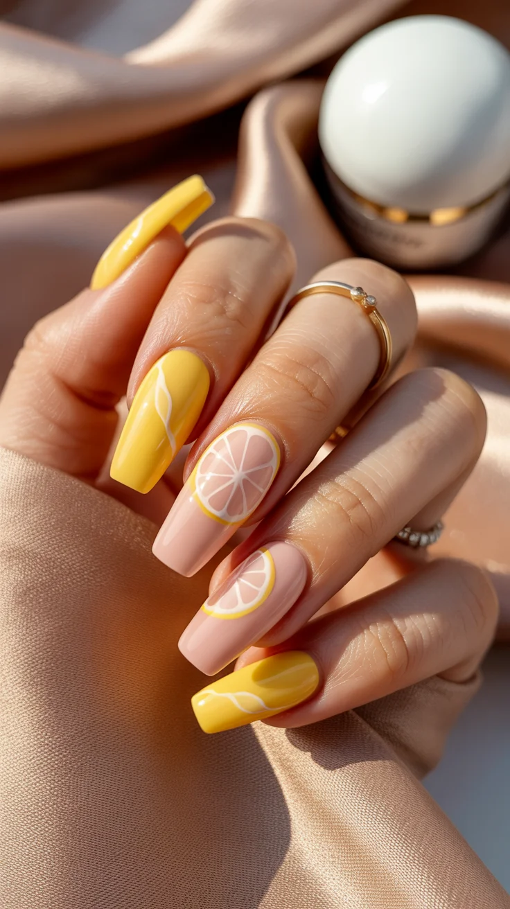
When I approach designs like this, I think in layers. Each element—the base, the color blocks, the fine details—needs space to stand on its own. I usually map out the design lightly before committing, especially with something as structured as fruit patterns.
It’s not something I wear every week, but when I do, it completely changes how everything else feels. There’s an energy to it that’s hard to ignore.
Soft Nude Marble with Gold Fluid Lines
This look sits right at that intersection of minimal and luxe. A soft neutral base with gentle marbling creates depth, while touches of gold bring in just enough contrast to make it feel elevated.
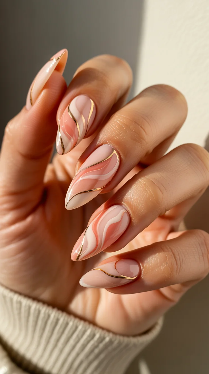
In the salon, I always remind myself not to overwork marble. The beauty comes from letting the tones blend naturally rather than forcing the pattern. The gold detailing should follow that same philosophy—fluid, not rigid.
I usually recommend this to clients who want something elegant without stepping into anything too bold. It’s understated, but it carries a certain weight.
Retro Waves in Blue and Yellow French Tips
This version of a French tip feels much more relaxed and current. Instead of sharp, traditional lines, the flowing waves introduce movement and a bit of personality without losing structure.
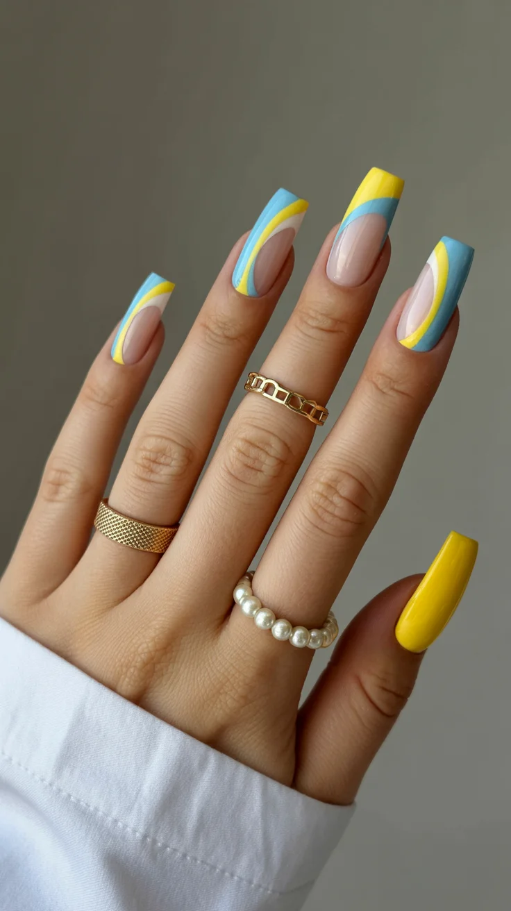
When I create this, I don’t aim for perfect symmetry. Slight variations actually make the design feel more modern. The base stays sheer and clean, allowing the colors to stand out without overwhelming the look.
I like this for moments when I want something creative but still wearable day to day. It’s playful, but it doesn’t feel overdone.
Neon French Tips That Feel Like Summer After Dark
There’s something striking about pairing a natural base with bold neon tips. It creates contrast in a way that feels sharp and intentional, especially on an elongated nail shape.
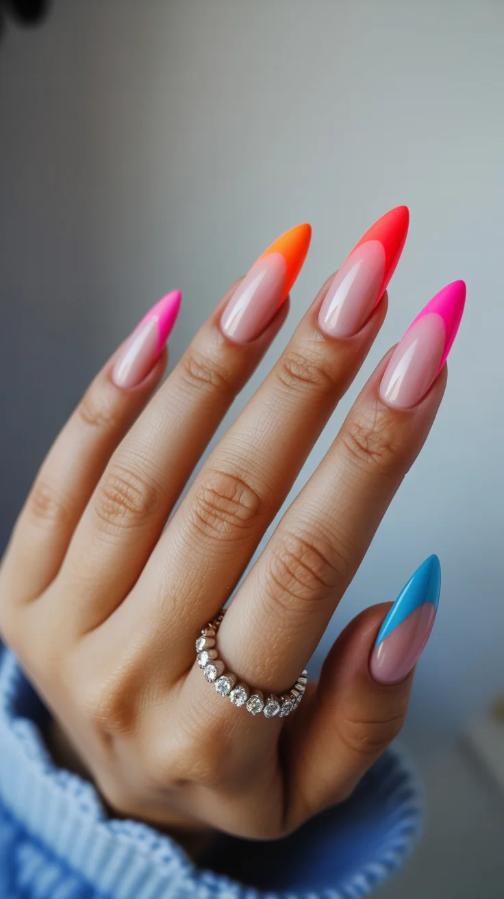
Technique matters here more than people expect. I always define the tip shape first before filling it in, making sure the lines stay crisp. The color payoff also needs to be strong from the first layer to keep that clean finish.
This is my go-to when I want a look that transitions easily from day into evening. It’s bold, but still controlled.
Hot Pink Floral Accents with a Glossy Nude Base
Floral designs always come back around, but the key is how they’re executed. Pairing bright pink accents with a soft base keeps the look balanced instead of overwhelming.
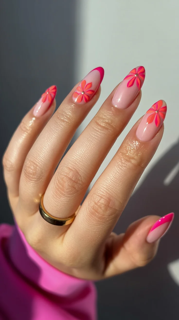
I usually build each flower gradually, starting with simple strokes and then adding depth. Layering tones makes a noticeable difference—it keeps the design from looking flat and gives it a more dimensional feel.
For me, this kind of manicure adds a lightness to everything. It feels expressive without being too loud.
Electric Rainbow Waves for Beach Days and Beyond
This design is all about movement and color. Multiple bright shades flowing together create a look that feels energetic and spontaneous, without needing strict structure.
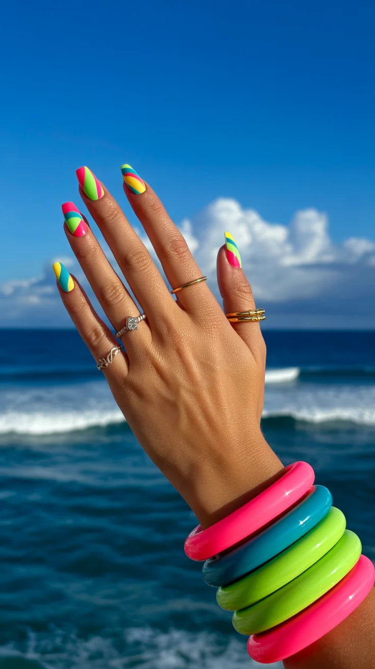
When working on something like this, I allow a bit more freedom in the process. The lines don’t need to be identical, and that’s actually what makes the design work. It feels more organic that way.
I usually save this style for moments when I want something fun and a little unexpected. It’s not subtle—but that’s the point.
Soft Pastel Color Blocking for an Elevated Everyday Look
Color blocking in softer tones offers a nice balance between playful and refined. Each nail carries its own shade, but together they feel cohesive rather than random.
From a technical perspective, consistency is everything. The shape, the finish, and the application all need to be clean, because softer colors tend to highlight imperfections more easily.
I like this for everyday wear. It’s simple, but it shows intention.
Glossy Pastel Ombre for a Soft Summer Glow
There’s something about a smooth gradient that always feels timeless. Blending soft tones into each other creates a finish that looks almost diffused, rather than sharply defined.
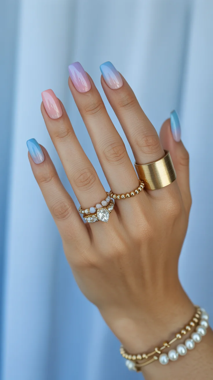
I typically build ombre in layers, using light pressure to merge the shades gradually. Rushing this step can make the transition look uneven, so patience really pays off here.
This is one of those looks that feels gentle but still visually interesting. It doesn’t need extra detail to stand out.
Muted Sage Green for Quiet Luxury Summer Days
Softer greens have a way of feeling grounded while still being fresh. This shade sits comfortably between neutral and statement, making it incredibly versatile.
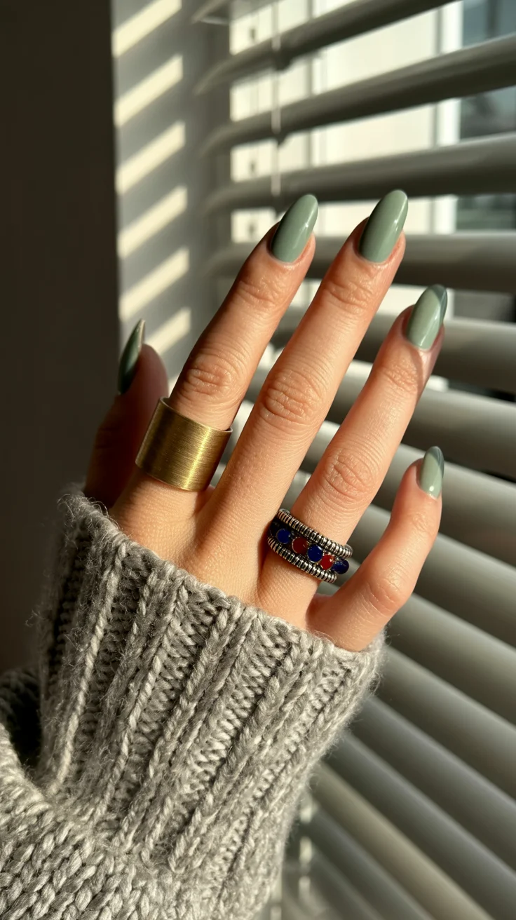
Application is straightforward, but I always focus on achieving an even tone. Any streaking becomes noticeable with colors like this, so thin, controlled layers are key.
I turn to this when I want something different from typical summer brights but still seasonal. It feels calm, but very considered.
Playful Daisy Mix with Polka Dot Accents
This design leans into a more relaxed, slightly nostalgic feel. Combining florals with simple dot details creates a mix that feels light without becoming overly decorative.
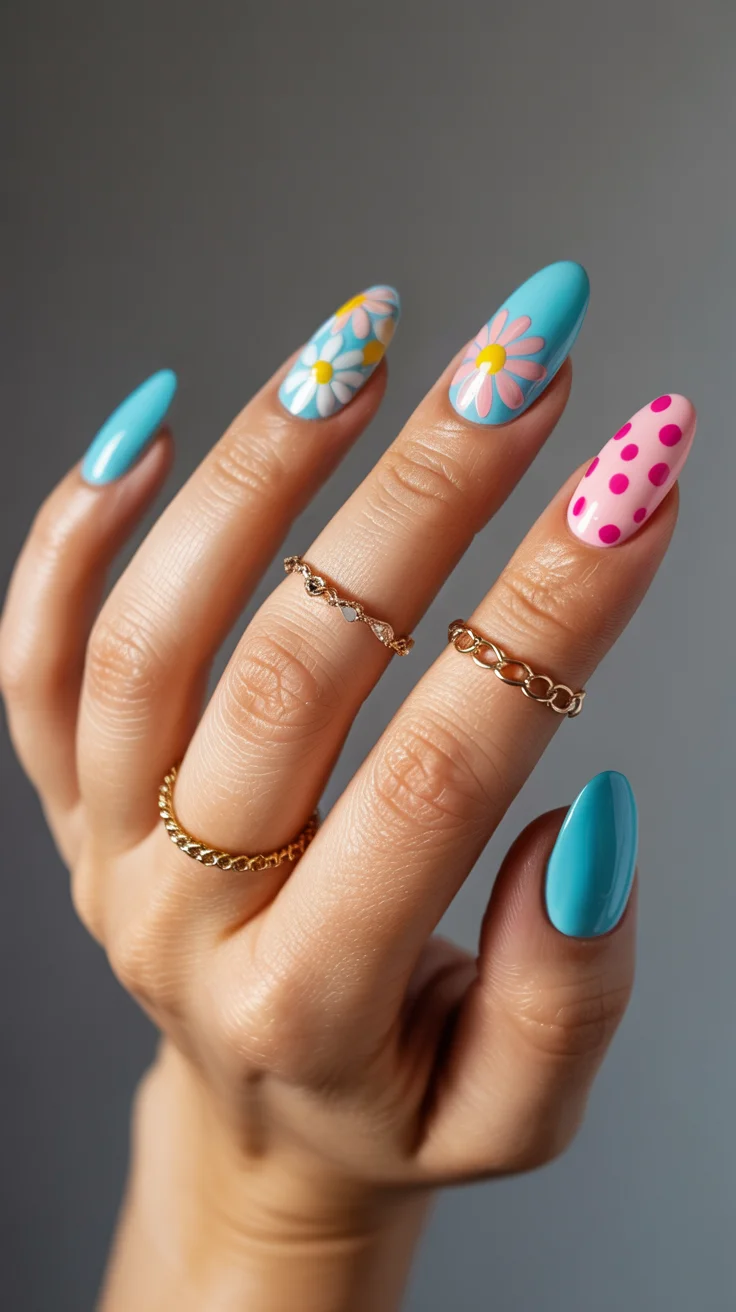
I approach this by planning placement first. Even though it looks casual, balance still matters. Leaving enough space between elements helps everything feel intentional.
It’s a style I enjoy when I want something cheerful but still wearable across different settings.
Fresh Green Floral Contrast with Almond Precision
This combination of soft green and blush tones creates a nice contrast that still feels cohesive. Adding structured floral elements brings in detail without overwhelming the base colors.
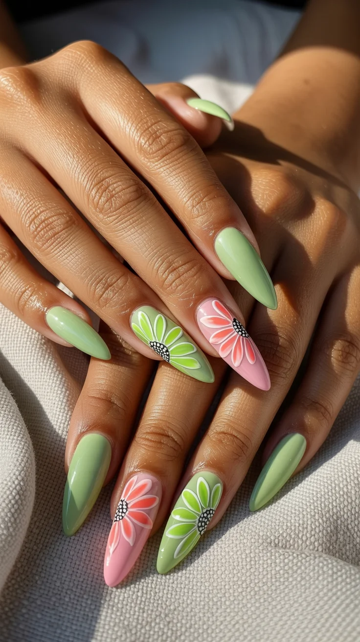
I take a slower approach with designs like this, building each element step by step. Clean lines and controlled layering make a big difference in how polished the final result looks.
To me, this is one of those designs that works across different styles and age groups. It’s versatile, which makes it a strong choice.
Coral Gloss with Gold Wave Detailing
Coral always brings energy, but pairing it with soft metallic accents refines the overall effect. The gold detailing adds movement without taking away from the base color.
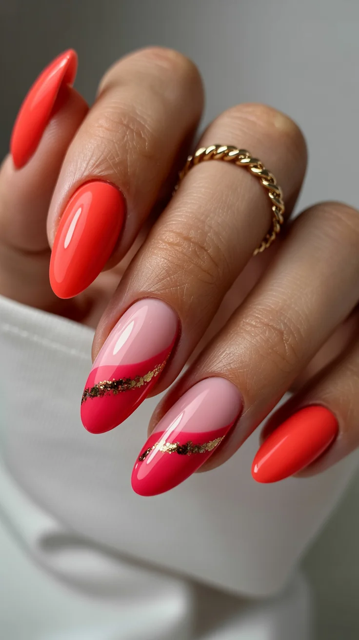
I usually apply the coral first, making sure the finish is smooth and even, then go in with the metallic lines in a single, fluid motion. Overworking the lines can make them look stiff, which takes away from the design.
This is something I wear when I want a bit more presence without going too bold. It feels balanced.
Tropical Pink Mix with Watermelon and Palm Accents
This design brings multiple elements together in a way that feels lively and expressive. Mixing textures, colors, and small details creates a layered look that stands out.
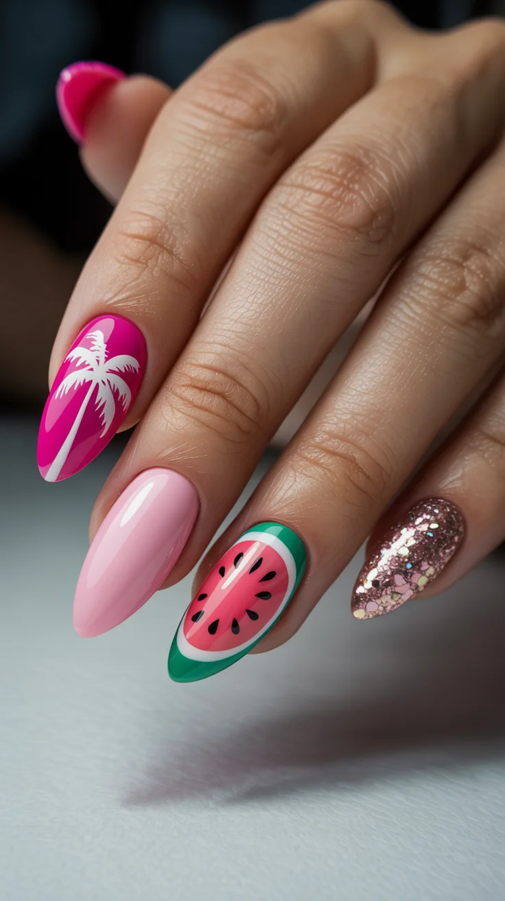
I treat each nail as its own small composition, making sure the elements don’t compete with each other. Spacing and proportion become especially important here.
It’s not an everyday style for me, but it’s perfect when I want something that feels playful and full of character.
Soft Nude Flames with a Whisper of Pastel Edge
This is a more subtle take on graphic design. The flame-like shapes are softened through color choice, creating movement without harsh contrast.
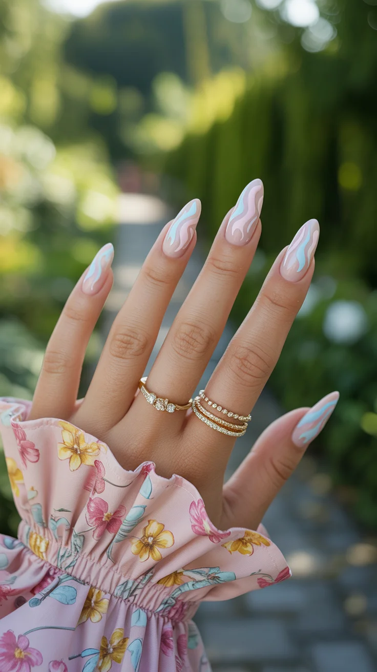
I keep my hand light when working on these details, allowing the shapes to stay fluid rather than overly defined. That softness is what gives the design its modern feel.
It’s a good option when I want something slightly different without stepping too far outside minimal territory.
Coral Bloom with Statement Daisy and Graphic Accent
This look combines bold color with structured detailing. The floral element draws attention, while the graphic accent adds a bit of contrast that keeps the design interesting.
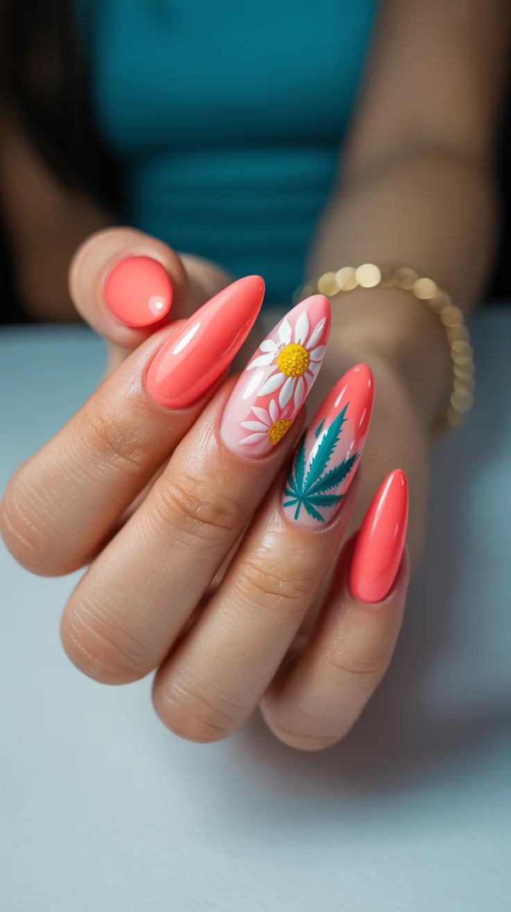
I build the flower gradually, focusing on clean edges and balanced proportions. The additional detail should complement, not compete with it.
It’s a design that feels bright and confident, without becoming overwhelming.
Classic Coral Gloss for Effortless Summer Polish
Sometimes the simplest option ends up being the most effective. A solid coral manicure, done cleanly, always feels appropriate for the season.
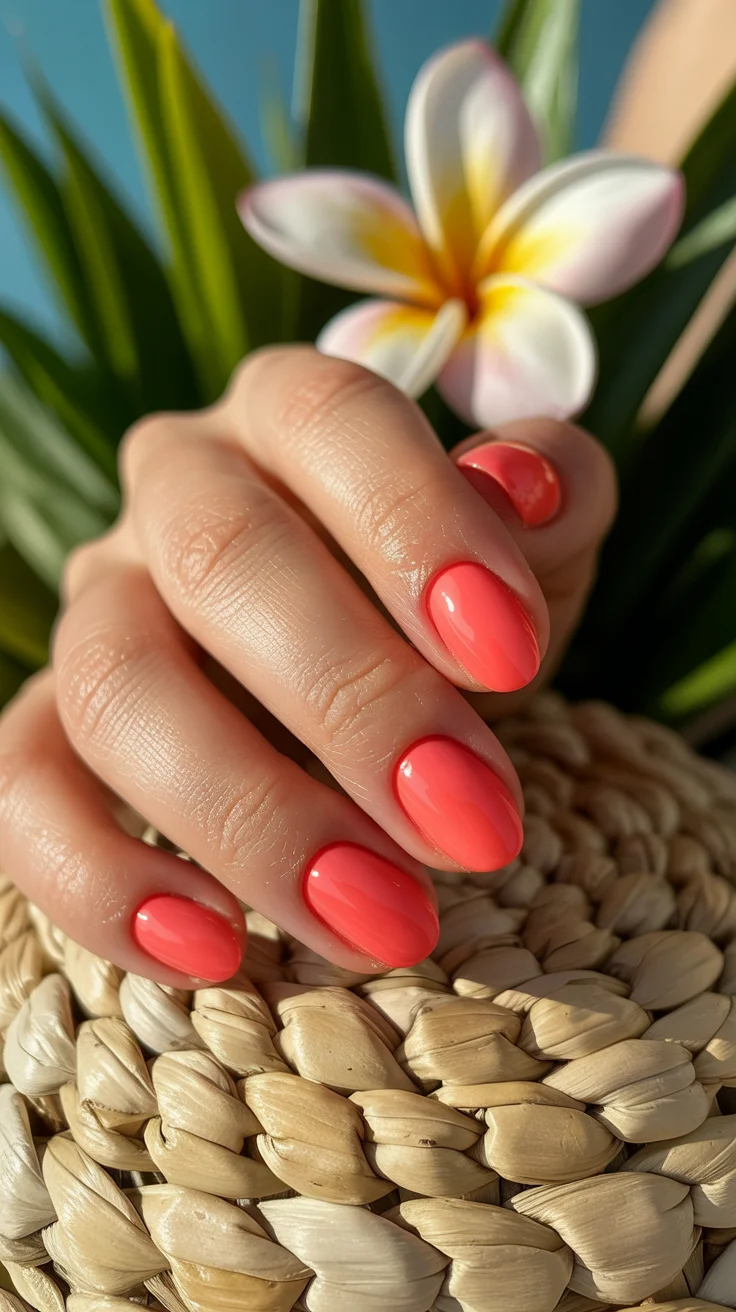
I pay extra attention to prep here, because a single-tone look leaves no room for imperfections. Smooth application and a high-gloss finish are essential.
I come back to this often. It’s reliable, and it always looks polished.
Sunset Ombre in Pink and Butter Yellow
This softer gradient blends warm tones in a way that feels natural and easy. The transition between shades should be smooth enough to almost disappear.
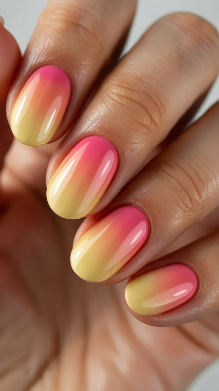
I build this slowly, allowing each layer to set before adding more color. It helps maintain control over the blend and keeps the finish even.
It’s a look that feels warm and relaxed, without needing additional detail.
Bold Sunset Gradient with Pink, Orange, and Violet Blend
This version pushes the color story further. Stronger tones create a more dramatic transition, especially when paired with a refined nail shape.
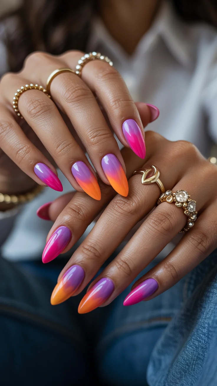
I approach it the same way as any gradient, but with more attention to color placement. Each shade needs to flow into the next without becoming muddy.
This is for moments when I want something more noticeable. It’s bold, but still thoughtfully executed.