Blog
Nail Art Ideas for Summer 2026 That Feel Fresh, Playful, and Totally Wearable
Summer always catches me mid-transition — one moment I’m living in soft, muted tones, and the next I’m reaching for shine, color, and finishes that feel a little more alive. It happens every year in my studio too. Clients start asking for something different… something that feels like a shift, not just a change in shade.
So I have to ask — are you still playing it safe, or are you ready to let your nails carry a bit more personality this season?
Because summer 2026, at least from what I’m seeing behind the chair, isn’t about keeping things “nice” or predictable. It’s about expression. Little details that reflect your mood, your energy, even your pace of life. And once you start leaning into that… it’s very hard to go back to basics.
Ocean Breeze Palms and Sunlit Blues
I always find myself pulled toward cool blues when summer starts to settle in—it instantly shifts my mindset. This look captures that feeling with a soft wave-like fade and delicate palm details that don’t overpower the nail. The shape gives it a slightly structured finish, while those fine metallic touches catch light in such an effortless way. It’s relaxed, but still feels styled.
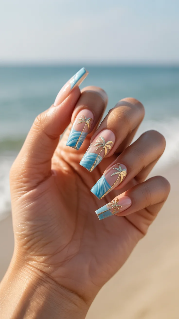
When I create something like this in the studio, I focus on building the gradient slowly. Rushing it takes away that airy effect. The palms come last, using a light hand so they feel like part of the design, not sitting on top of it.
It’s one of those manicures that quietly stands out. Not loud—but definitely noticed.
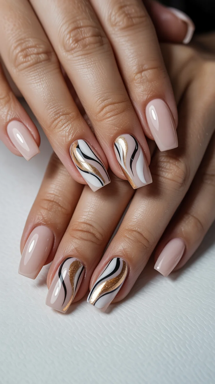
Soft Sculpted Neutrals with Liquid Gold Lines
There’s a certain confidence in keeping things minimal, especially in summer when everything else feels more expressive. This look leans into that with a soft neutral base and fluid gold detailing that almost moves across the nail. It reminds me of fine jewelry—subtle, intentional, and timeless.
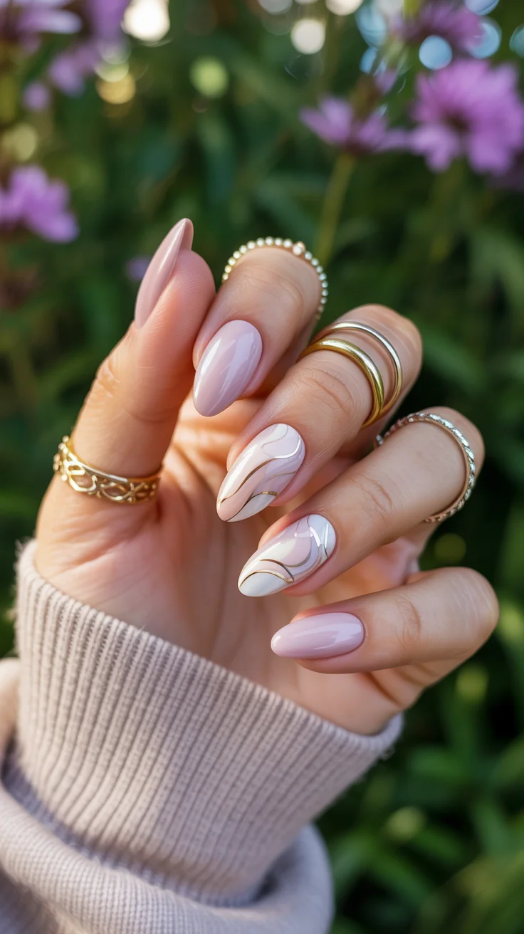
In my experience, the key here is restraint. I usually start with one flowing line and build around it only if it feels necessary. Overworking it takes away that refined finish.
This is the kind of manicure I recommend to clients who want something elevated but still effortless. It fits into any setting without trying too hard.
Delicate Florals and Butterfly Accents
There’s always a point in the season where softer details just feel right. This design leans into that with light floral work and a small butterfly accent that adds personality without overwhelming the look. It feels airy and slightly romantic, but still modern.
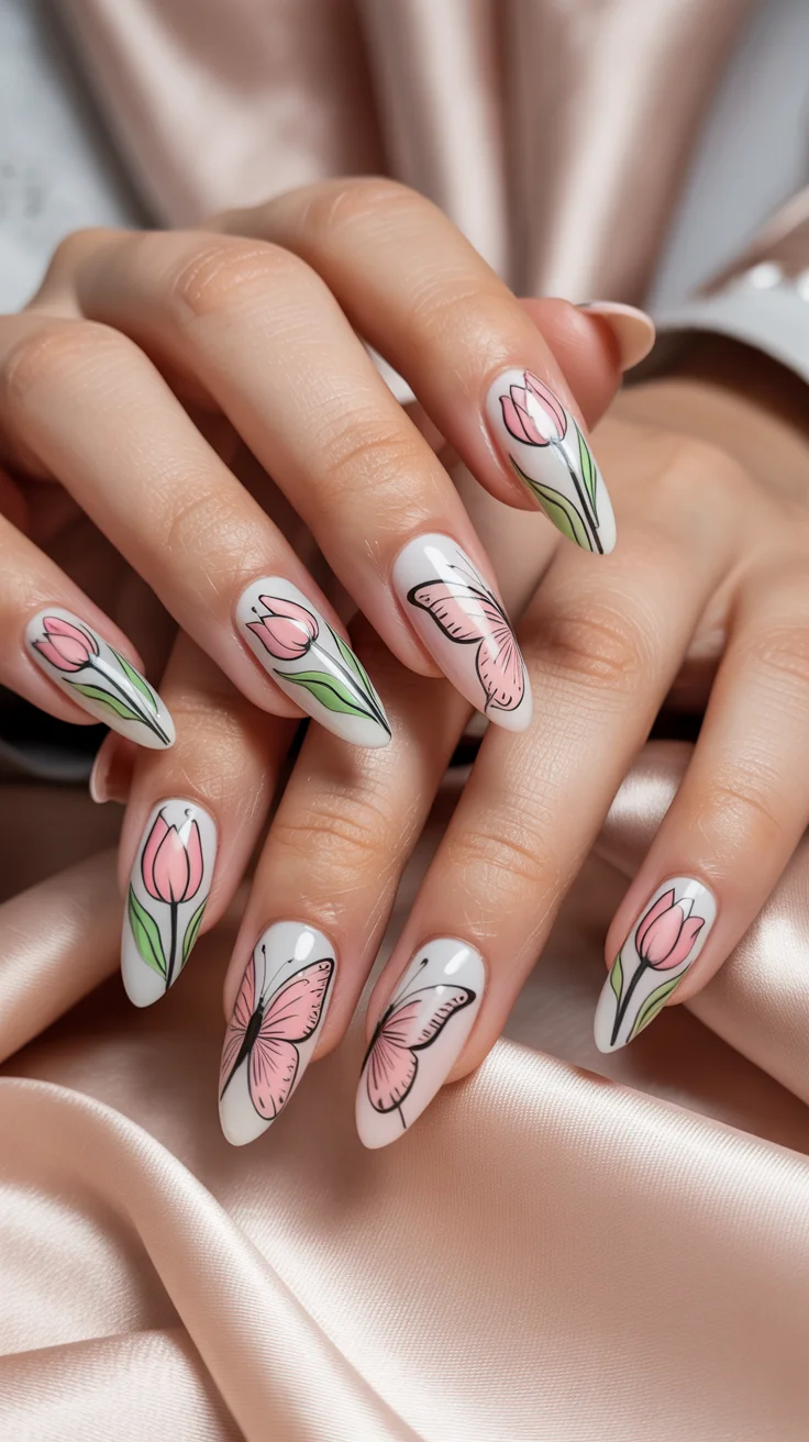
When I work on designs like this, I approach them almost like sketching. I map out placement first, then build color in thin layers so everything stays soft and dimensional.
It’s a style that feels thoughtful—perfect for moments when you want something gentle but still expressive.
Seafoam Gloss with Shell and Crystal Details
This is where summer starts to feel playful again. A fresh seafoam tone paired with subtle embellishments brings in that ocean-inspired energy without going overboard. The shine, the texture, the light reflection—it all works together in a really balanced way.
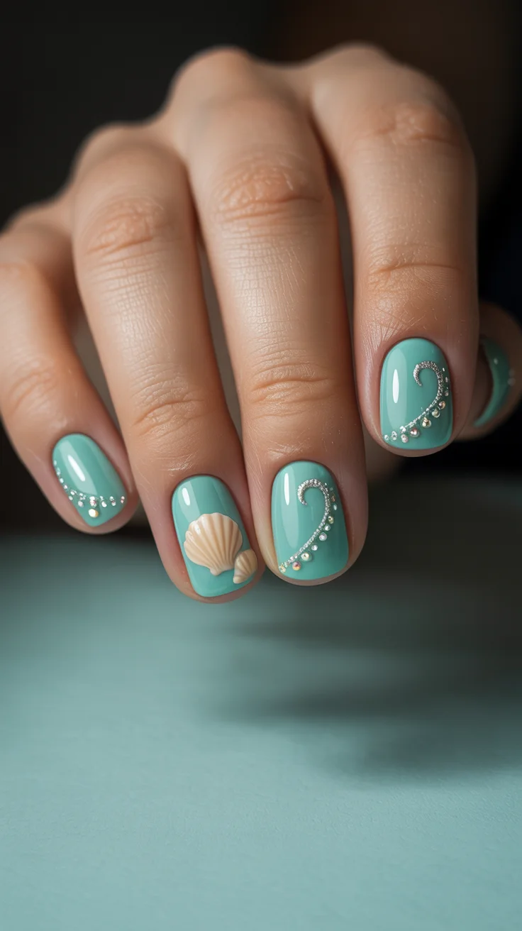
I always make sure embellishments are placed with intention. Spacing matters more than quantity. A few well-placed details can completely transform a simple base.
It’s slightly more statement-making, but still wearable if you keep the composition clean.
Glossy Nude Waves with Metallic Accents
I come back to designs like this often because they sit right in that sweet spot between simple and interesting. A nude base keeps things grounded, while flowing lines add movement and depth. It’s understated, but never flat.
When I create these wave details, I let the lines stay slightly imperfect. That natural flow actually enhances the design—it shouldn’t feel too rigid.
This is one of those looks that works with everything, which is exactly why it never goes out of style.
Chrome Roses with a Futuristic Shine
Chrome always feels a little bold at first—but when it’s paired with something soft, it becomes surprisingly wearable. That contrast between a reflective base and delicate floral detailing creates a really striking balance.
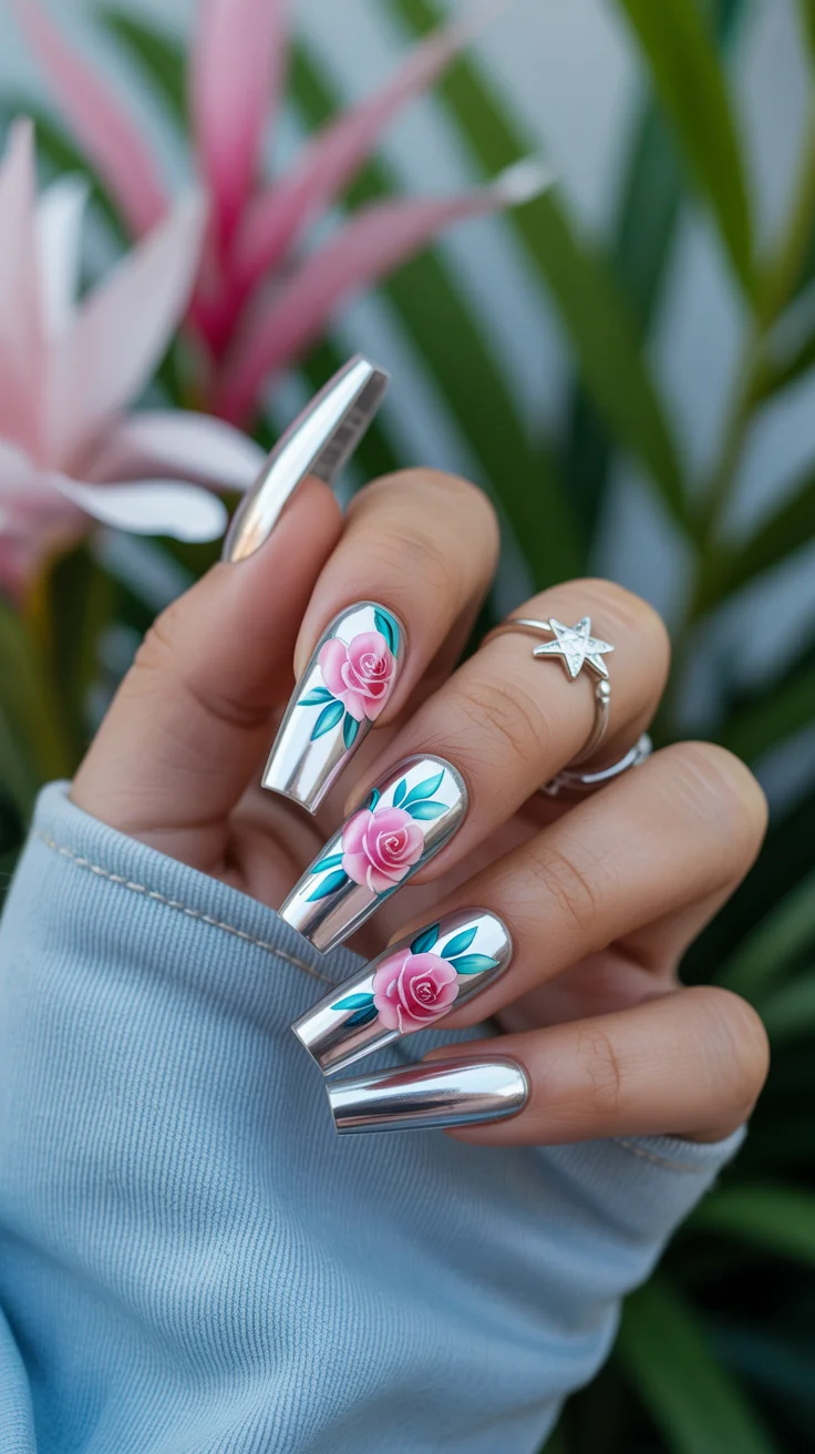
From a design perspective, it’s all about layering. The base needs to be smooth and reflective, while the roses stay soft and dimensional so they don’t compete with the shine.
It’s definitely a statement, but one that still feels refined when done right.
Playful Strawberries and Daisy Daydreams
This design brings in that carefree summer energy in the best way. Small fruit details, tiny florals, and a light base keep everything feeling fresh instead of overwhelming. It’s playful, but still considered.
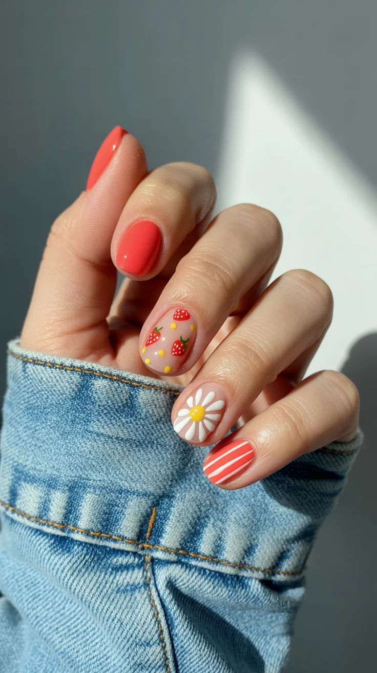
When I work on designs like this, I avoid making everything too perfect. A little variation in shape and spacing gives it that hand-painted charm.
It’s fun, easygoing, and honestly hard not to smile at.
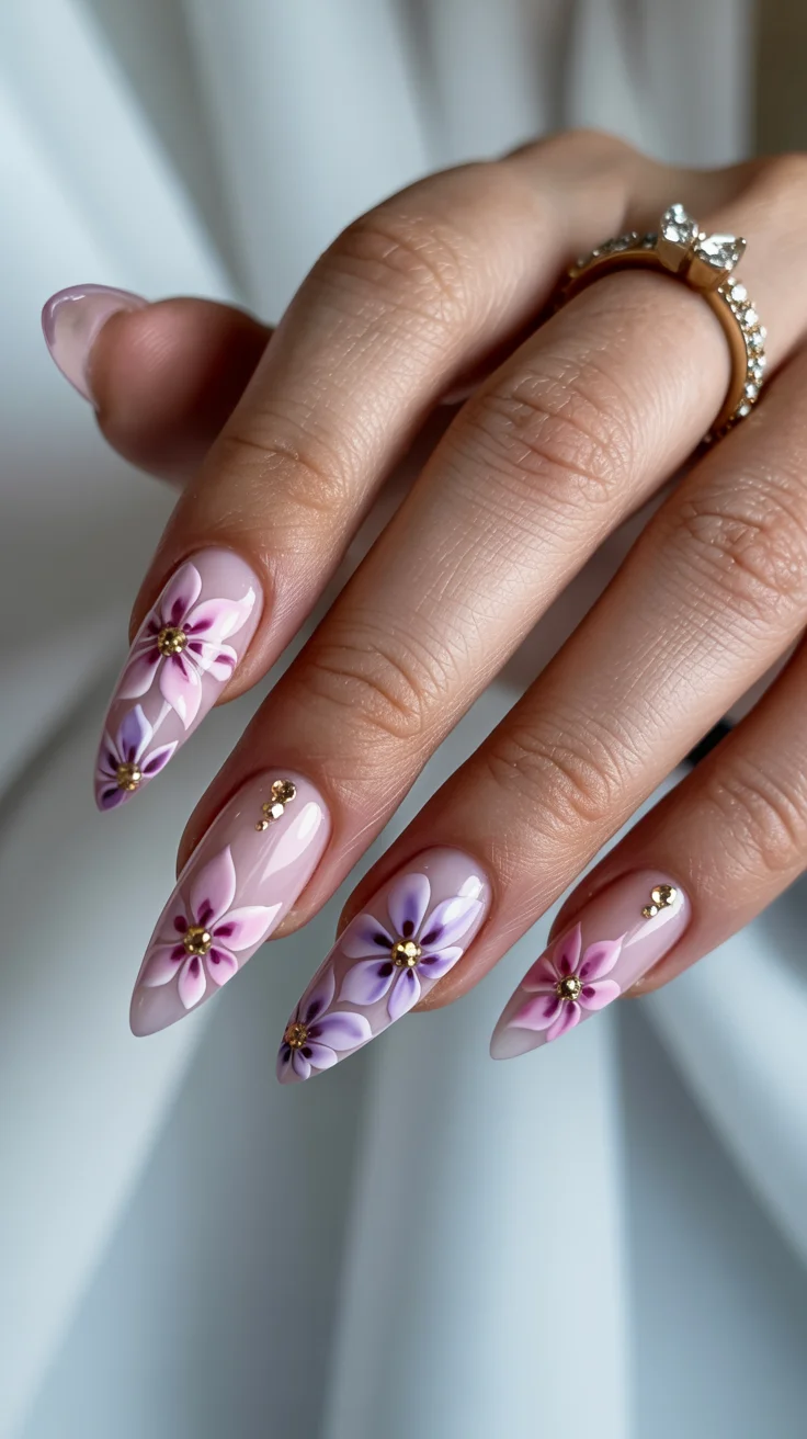
Lavender Bloom Sculpted Elegance
Lavender is one of those shades I rely on when I want something soft but not predictable. Adding sculpted floral elements gives it more dimension without making it feel heavy.
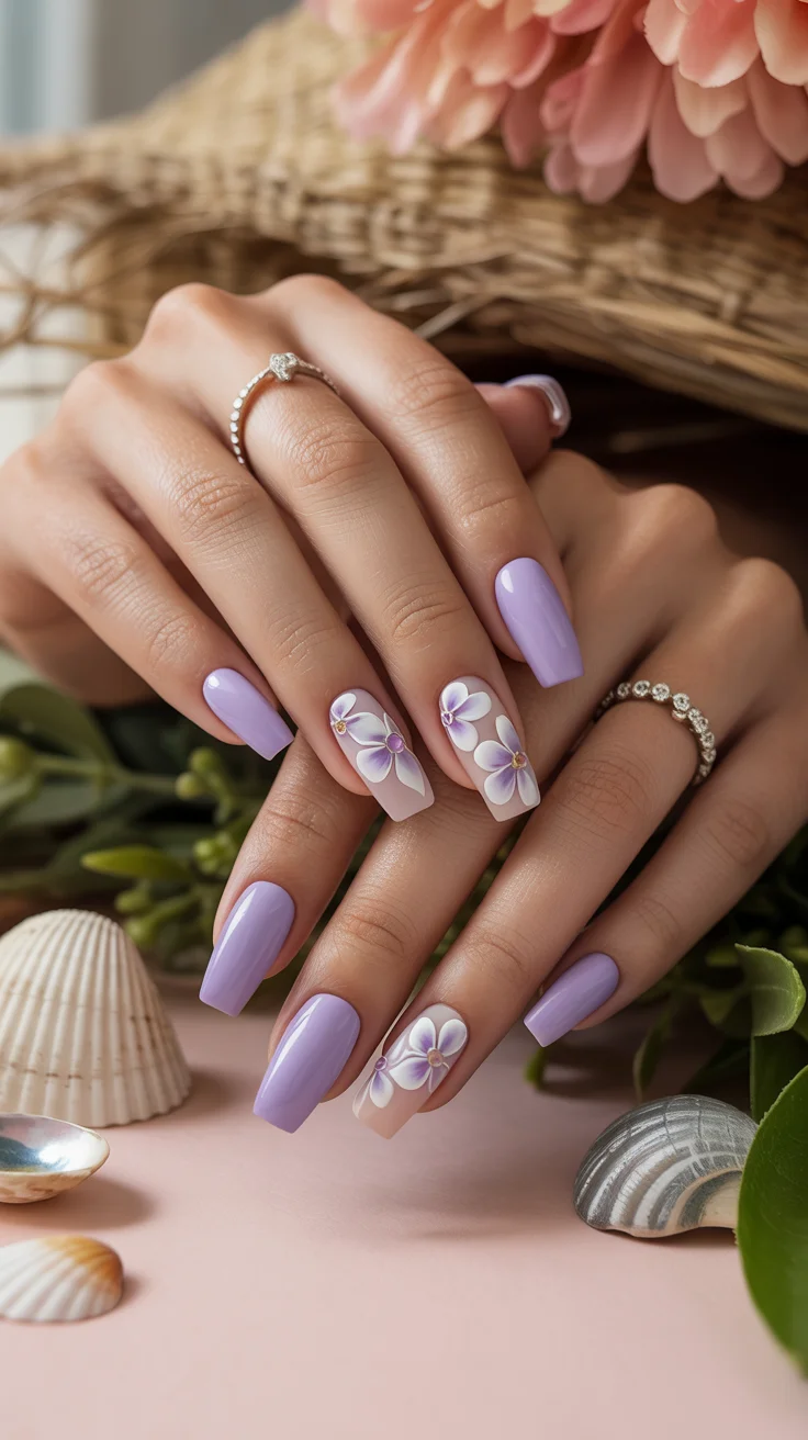
Building these details takes patience. I layer slowly, curing in between, so the structure holds and the petals keep their shape.
The end result feels polished with just a hint of artistry—perfect for occasions that call for something a little extra.
Soft Pink Florals with Golden Accents
There’s a quiet beauty in keeping tones soft and details minimal. This look blends delicate floral work with subtle metallic touches that catch the light just enough.
I usually keep the placement slightly uneven so it feels more natural. Too much symmetry can make designs like this feel stiff.
It’s a calm, balanced style that works when you want something feminine without leaning too sweet.
Neon Watermelon Pop
And then there are days when subtle just isn’t the mood. This design leans fully into bold color with sharp contrast and playful detailing that feels energetic and fun.
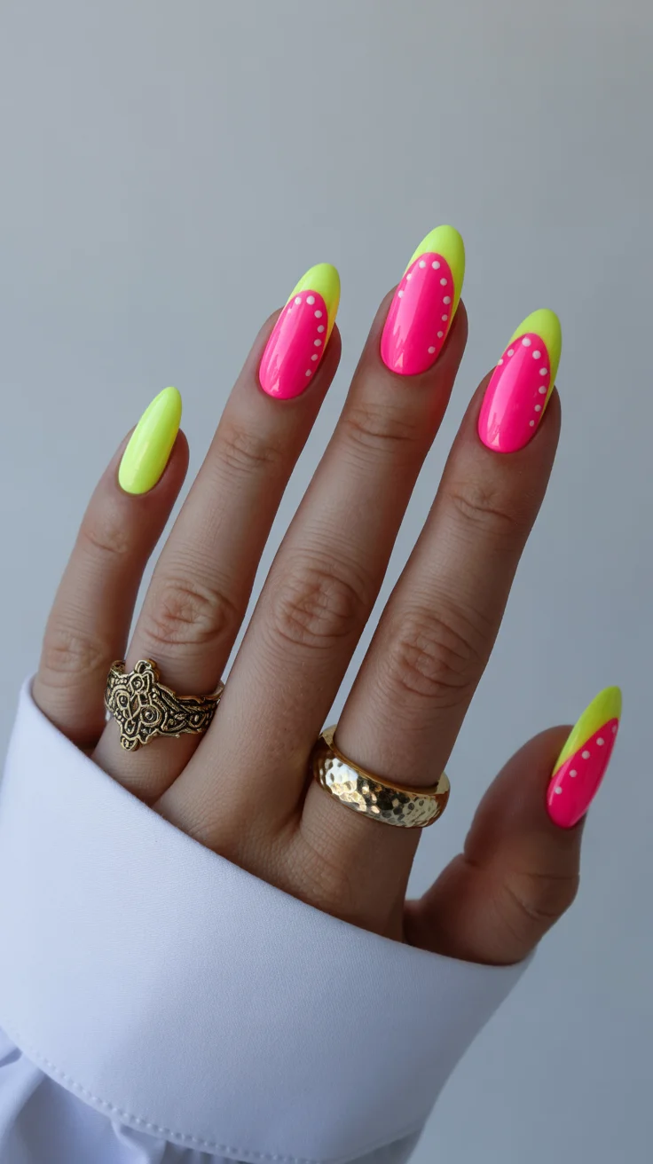
Working with neons takes a bit more layering to get that full intensity. I always build them over a light base so the color really stands out.
It’s vibrant, eye-catching, and unapologetically summery.
Playful Pastel Pop Art for Slow Summer Mornings
There’s something about soft pastels that feels instantly calming. This design keeps things light with scattered shapes and gentle color combinations that don’t compete with each other.
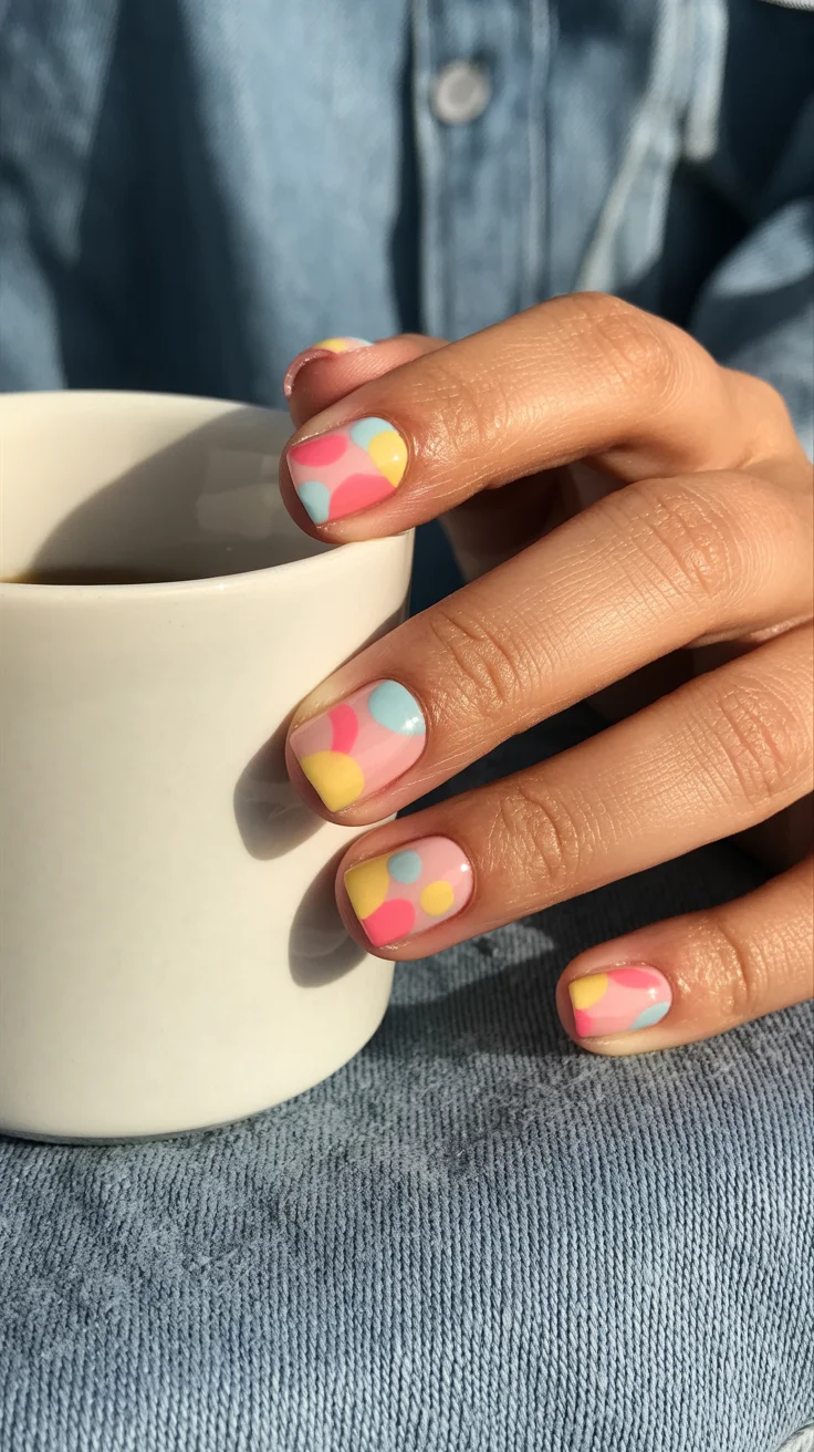
I like to vary the size of the elements so the pattern feels organic. It’s less about precision and more about balance.
It’s simple, but still creative enough to feel fresh.
Peach Marble with Fine Gold Veins
Marble designs always have this natural elegance to them, especially when paired with warm tones. The soft blending creates movement, while fine metallic accents add structure without taking over.
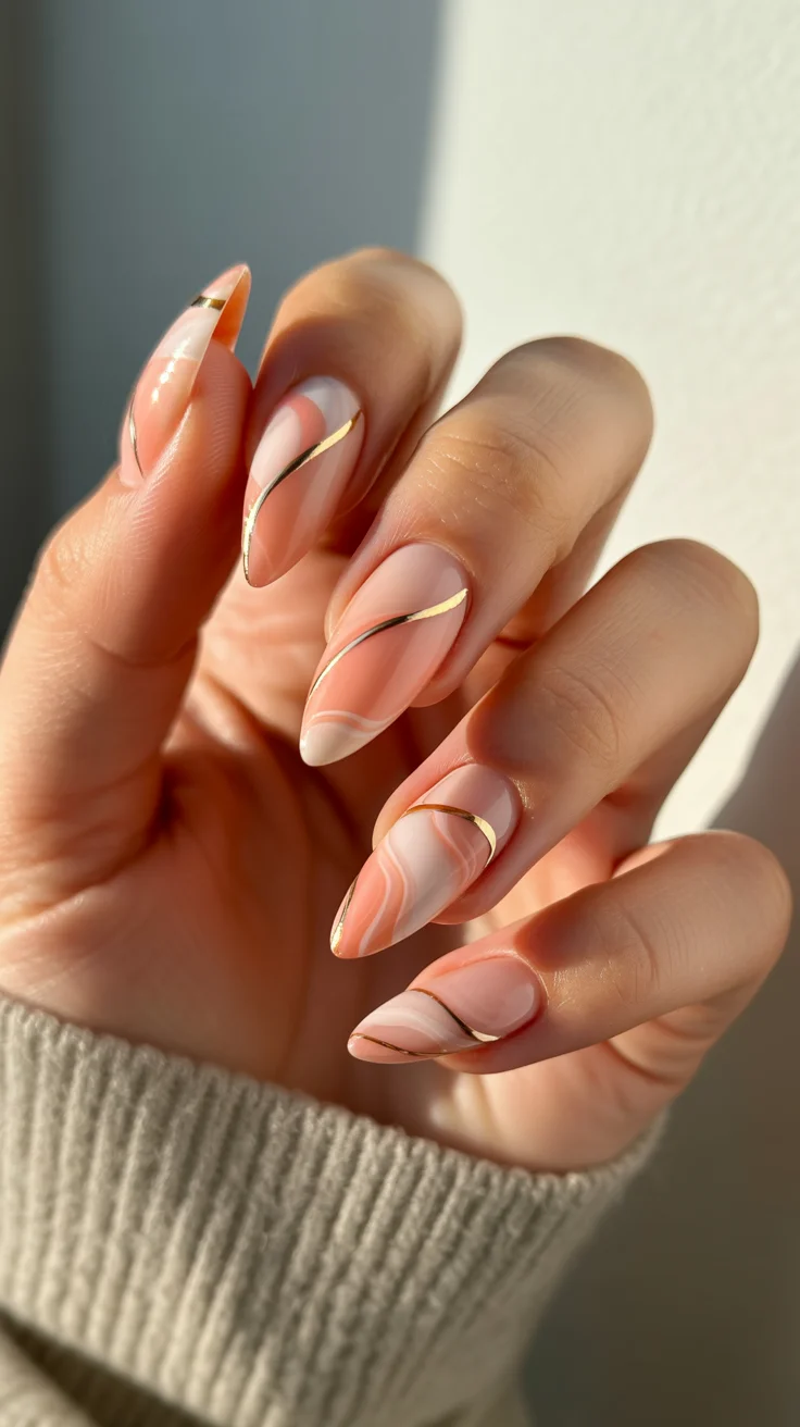
The trick is to let the colors move on their own. Over-blending removes that natural effect that makes marble so appealing.
It’s refined, versatile, and easy to dress up or down.
Fresh Mint Minimalism with Polka Accent
Sometimes, one shade done well is all you need. This look keeps things clean with a fresh pastel tone and just one small detail to break it up.
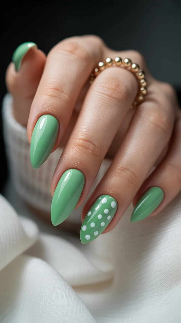
I always focus heavily on prep with minimal designs. When there’s less going on, the finish needs to be flawless.
It’s calm, polished, and perfect when you want something low effort but still intentional.
Strawberry Milk Chrome with Playful Fruit Details
Mixing finishes can completely transform a design, and this is a perfect example. A soft reflective base paired with tiny illustrative details creates contrast without clashing.
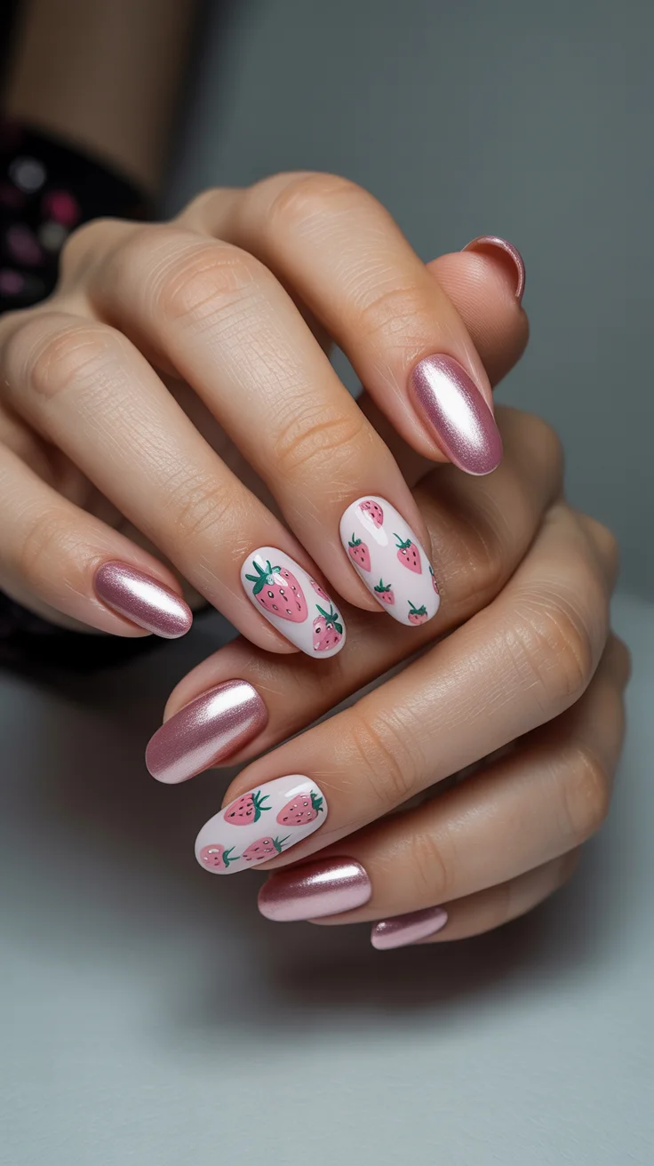
I keep the fruit elements slightly varied so they don’t look too uniform. That small imperfection adds character.
It’s sweet, modern, and just a little unexpected.
Matte Pink with Graphic Pineapple Accent
Matte finishes instantly shift the tone of a manicure. Pairing that softness with bold graphic elements creates a really interesting contrast.
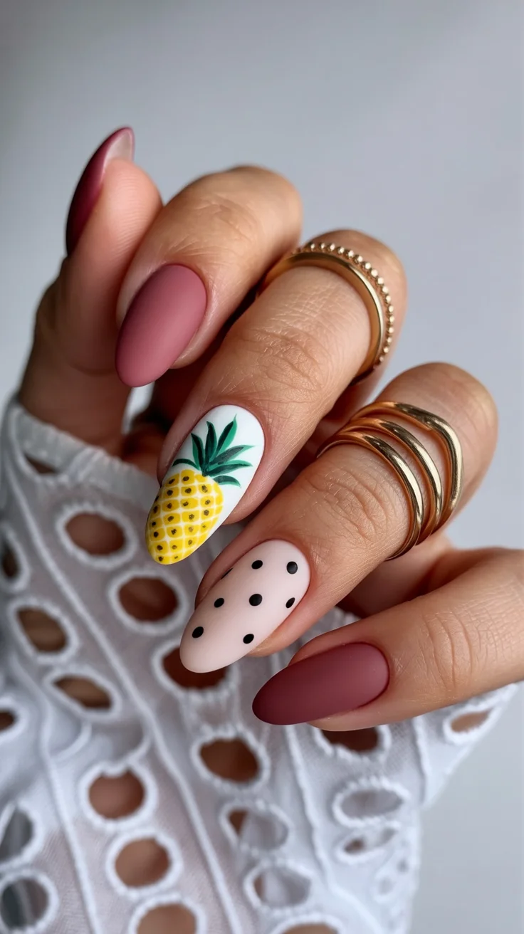
I usually apply the matte top coat at the very end to bring everything together. It tones down the colors while still letting the details stand out.
It’s playful, but with a slightly more structured feel.
Glossy Candy Hearts in Sunset Pink Tones
This design feels lighthearted in the best way. Bright tones paired with small details create something fun without feeling overwhelming.
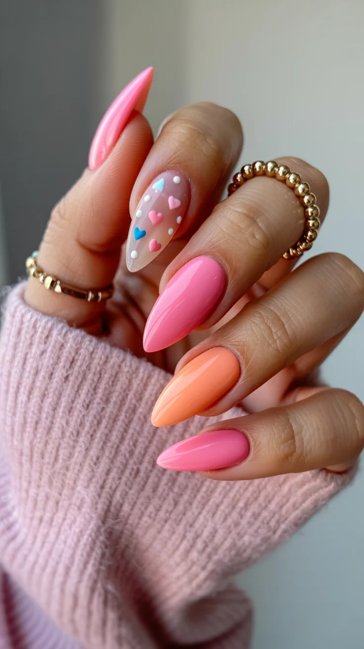
Spacing is what makes it work. Leaving room between elements keeps it from looking too busy.
It’s a great option when you want something cheerful and a little nostalgic.
Maximalist Garden Florals with Crystal Details
This is where detail takes center stage. Layered florals, soft tones, and subtle embellishments come together to create a full, dimensional look.
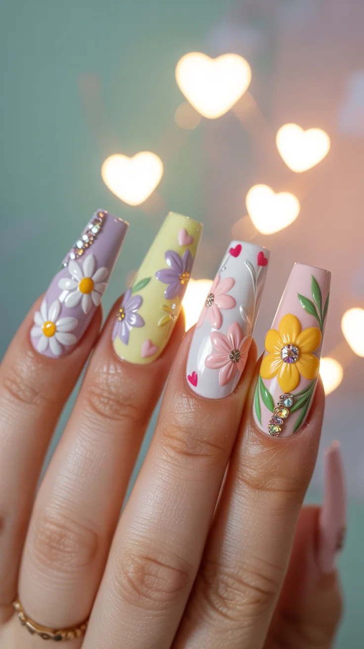
I always approach designs like this step by step. Building layers carefully keeps everything from blending into one.
It’s bold, intricate, and perfect for moments when you want your nails to feel like part of your overall look.
Soft Blue and Pink Daisy Contrast
Color contrast can be incredibly effective when it’s kept balanced. This combination feels fresh, with just enough detail to keep it interesting.
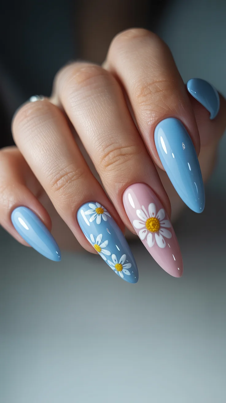
I tend to place floral elements slightly off-center so the design feels more relaxed.
It’s easy to wear, but still has personality.
Bold Retro Florals with Color Blocking
There’s something really satisfying about bold shapes and strong color combinations. This design leans into that with confident placement and graphic floral elements.
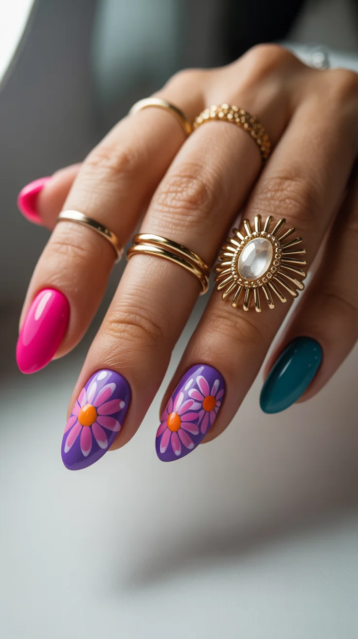
It’s less about perfection and more about commitment. The shapes need to feel intentional, not overly refined.
It’s expressive, playful, and full of character.
Sunny Yellow with Graphic Sunflower Accent
This look brings warmth in a really grounded way. The rich yellow base feels vibrant, while the sunflower detail adds a focal point without overwhelming the design.
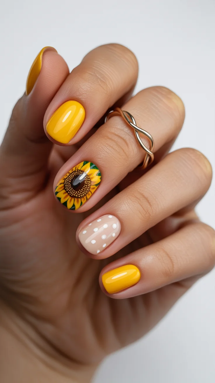
Balancing bold and soft elements is key here. I like to keep supporting details subtle so the main feature stands out.
It’s bright, but still feels composed—a perfect way to round out a summer set.