Blog
Summer Swimwear for Women 2026: Fresh Styles, Flattering Fits, and Effortless Beach Looks
Every summer, I find myself in that exact same place—standing in the studio, racks full but still feeling like something needs a refresh. Not just new for the sake of it, but pieces that actually feel right. Wearable, flattering, and with just enough edge to make you feel a little more confident the moment you put them on.
So when I started looking at swimwear for 2026, I wasn’t thinking in strict trends. I was thinking in moods. Do we want something bold that shifts our energy? Something minimal that always works? Or those softer, more romantic pieces that feel a bit more expressive?
Let’s break it down the way I naturally approach styling—with different moods, different moments, and pieces that make sense for real summer days by the water.
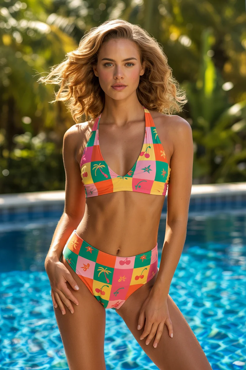
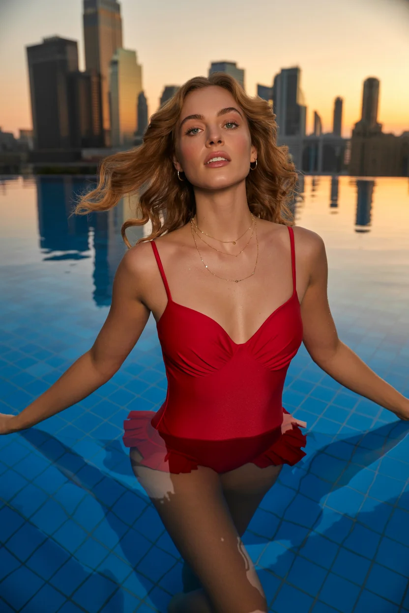
Soft Retro Lines and High-Waisted Confidence
I’ve worked with a lot of clients who want something that feels secure but still stylish, and this silhouette always comes up. A well-cut high-waisted bikini has a way of smoothing and shaping without feeling restrictive, which is why I keep recommending it season after season. For 2026, I’m seeing softer color stories—washed pastels, fluid prints, nothing too sharp or overpowering.
What makes this style stand out to me is how balanced it feels. When the top has just a bit of structure and the bottom sits higher on the waist, the whole look becomes effortless. You’re not adjusting straps or second-guessing the fit. It just works—and that ease translates into confidence the moment you step out.
Effortless Black One-Piece with That Borrowed Shirt Energy
There are days when I don’t want to over-style anything, and this is exactly the kind of look I reach for. A clean black one-piece is one of those pieces I always keep in my boutique because it suits almost everyone. When you throw an oversized white shirt over it, it instantly softens the look and adds that relaxed, slightly undone feel.
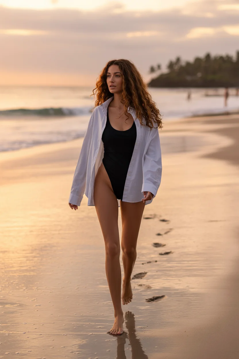
What I like most here is the versatility. I’ve styled this exact combination for clients who wanted something that could move from beach to lunch without a full outfit change. It’s simple, but it carries presence. And honestly, that’s what good summer styling should do—less effort, more impact.
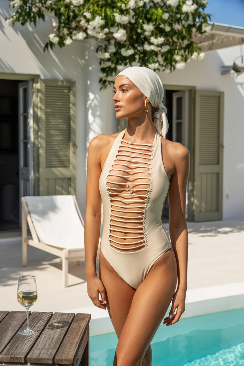
Romantic Texture and Feminine Drama in White
Every now and then, I design or select pieces that are less about practicality and more about feeling something. This is one of those. White swimwear with textured detailing—like sculpted florals or soft draping—creates a very intentional, elevated look.
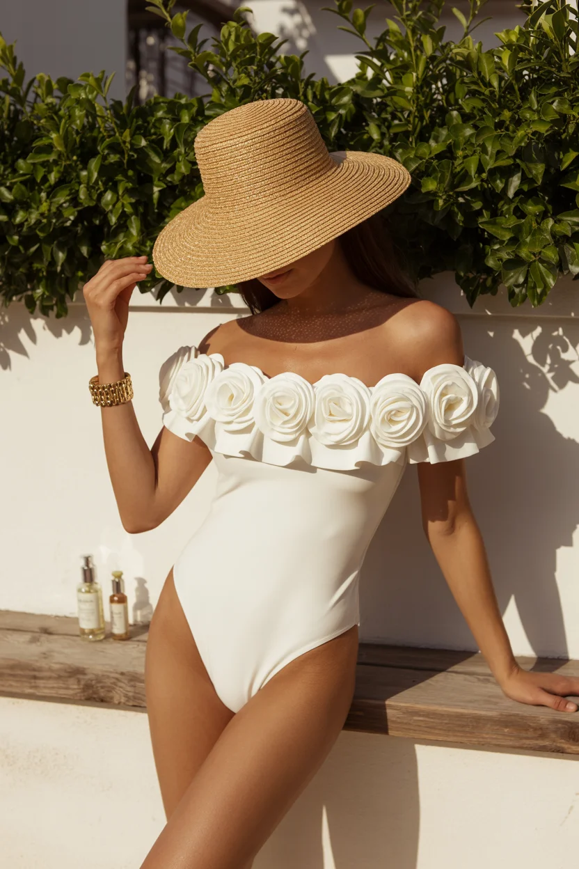
From my experience, texture does a lot of the work here. You don’t need bold colors or heavy accessories. The dimension in the fabric already adds depth and interest. When styled with minimal extras, it feels refined but still expressive. It’s the kind of piece that quietly stands out.
Sporty Neon and That Bold, Playful Confidence
I’ll admit, bold color can feel intimidating at first. But once you try it, it changes your whole energy. In my boutique, I’ve seen clients hesitate with neon tones, then completely light up once they put them on. There’s something about these shades that feels active and confident.
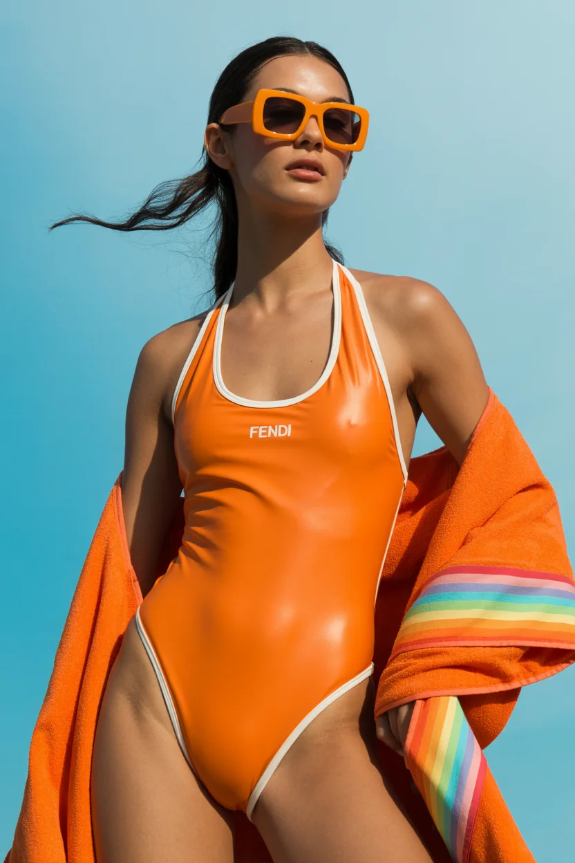
Paired with sporty cuts, the look becomes even stronger. Clean lines keep everything grounded, while the color brings the personality. It’s not about overcomplicating the design—it’s about letting one element lead. And here, color does all the talking.
Playful Prints and That Vacation-Ready Energy
Some pieces are just meant for fun, and I always make room for those in my collections. Printed swimwear brings a different kind of mood—lighter, more relaxed, less structured in feeling. It’s perfect for days when you’re not trying to curate every detail.
What I’ve noticed is that the right print can actually simplify styling. When the pattern carries enough personality, you don’t need to add much else. A well-fitted silhouette keeps everything in place, while the print gives it that carefree, holiday-ready finish.
Sculptural Cut-Outs and Barely-There Elegance
This season, I’ve been drawn to designs that feel almost architectural. Cut-out swimwear, when done right, creates shape in a very intentional way. It’s not about revealing more—it’s about placing details where they enhance the form.
I always tell my clients to look at how the lines move across the body. Good cut-outs guide the eye and create structure without feeling excessive. When paired with minimal accessories, the result feels polished and modern, not overdone.
Soft Blues and Relaxed Layering for Slow Summer Days
There’s a softness to certain color palettes that I keep coming back to, especially in summer. Light blues, gentle textures, relaxed silhouettes—they all create a calm, cohesive look. It’s the kind of styling that doesn’t try too hard.
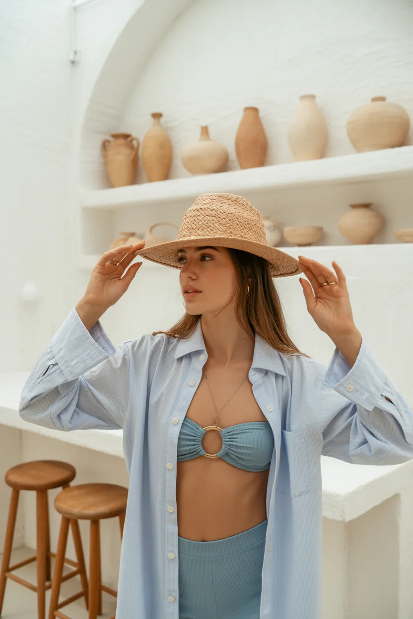
Layering plays a big role here. An oversized shirt or light cover-up adds dimension without disrupting the flow. I often recommend this approach to clients who want something easy but still put-together. It’s comfortable, but it still feels styled.
Minimalist Navy and the Return of Clean Lines
Minimalism only works when the fit is right—that’s something I’ve learned over years of working with different body types. A structured navy one-piece is a perfect example of that. It doesn’t rely on prints or bold colors, just precise tailoring.
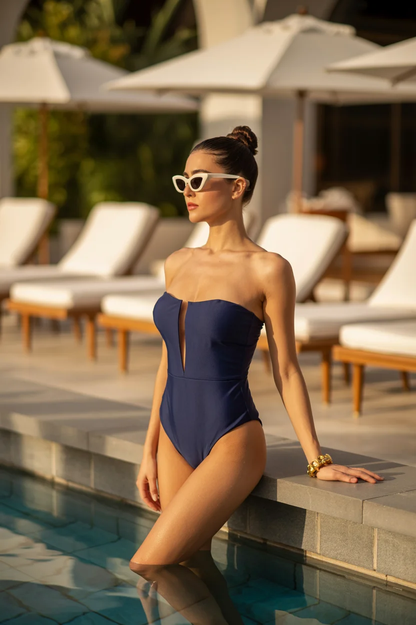
I appreciate how clean lines can create such a strong impression. When everything sits exactly where it should, the look becomes naturally refined. It’s understated, but it holds attention in a very quiet way.
Tropical Layers and That Easy Vacation Uniform
When I help clients pack for trips, I always suggest building a few reliable outfit formulas. This is one of them. A simple bikini paired with a lightweight layer—like a kimono or open shirt—creates a complete look without much effort.
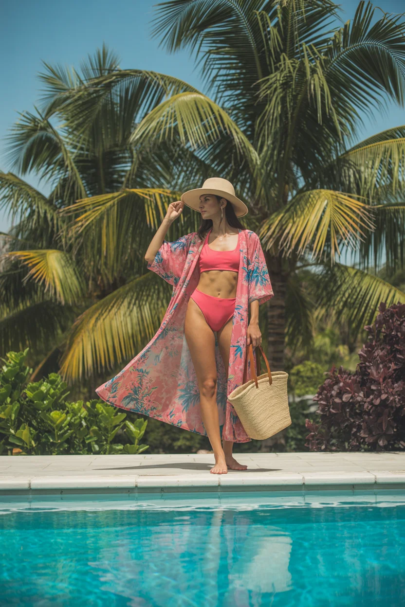
What works here is the combination of structure and movement. The base stays fitted, while the outer layer adds flow. It’s practical, easy to repeat, and still feels intentional every time you wear it.
Sunset Tones and Effortless Beach Femininity
Warm, sun-inspired tones have a way of enhancing everything around them. I’ve noticed that softer corals and faded hues tend to complement a wide range of skin tones, which makes them very wearable.
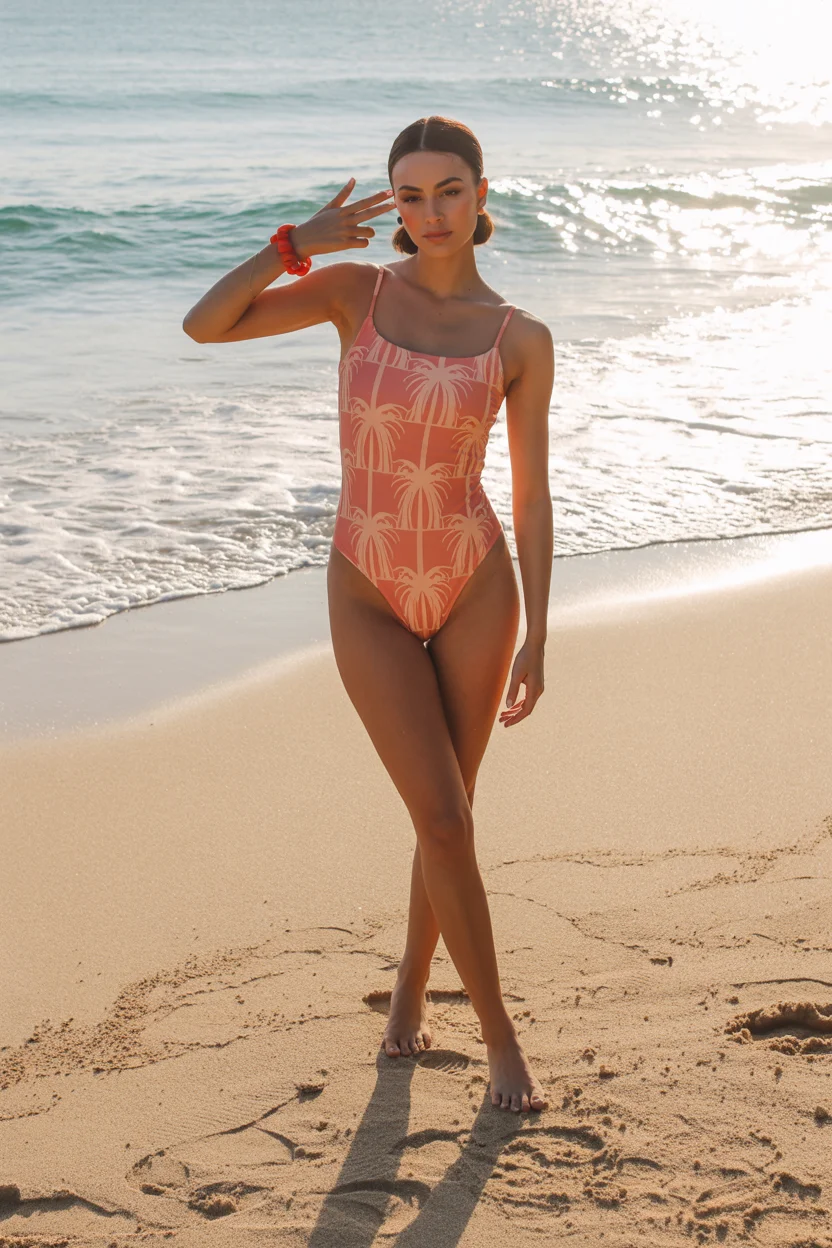
In this kind of design, simplicity is key. The shape stays classic, while the color adds personality. It doesn’t compete for attention—it blends naturally into the setting, which is exactly what makes it so appealing.
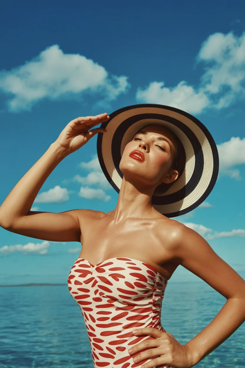
Classic Stripes and That Timeless Riviera Mood
Stripes are one of those patterns I never really move away from. They adapt easily, depending on how they’re styled. This season, I’m seeing more refined versions—cleaner lines, softer contrasts, more tailored silhouettes.
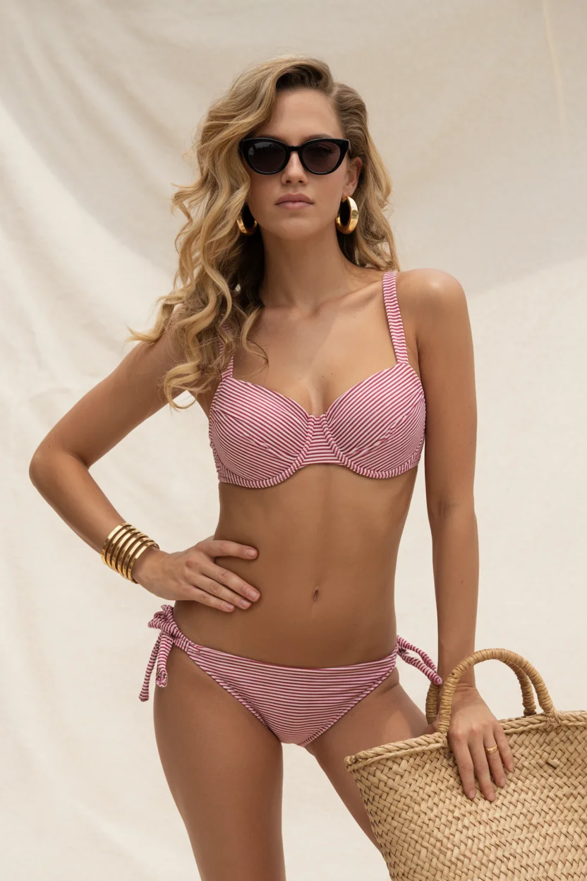
What I enjoy about this look is its polish. Structured tops add definition, while adjustable bottoms keep it relaxed. It strikes a balance between classic and current, which is always a strong place to be.
Gingham Revival and That Playful Beach Energy
Gingham brings a lighter, more nostalgic feel to swimwear. It’s approachable and easy to wear, which is why I often suggest it to clients who want something with personality but not too bold.
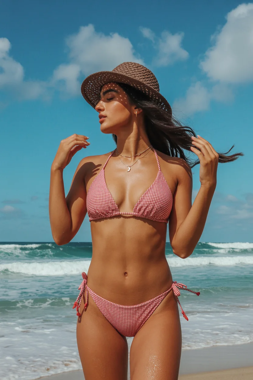
The simplicity of the cut allows the pattern to stand out without overwhelming the look. It feels effortless, slightly playful, and very natural for summer settings.
Bold Red One-Piece and the Return of Statement Femininity
Every collection needs at least one strong statement piece, and red always delivers. It’s a color that naturally draws attention, but when paired with a clean silhouette, it feels controlled rather than overwhelming.
I’ve seen how a well-fitted red one-piece can completely shift someone’s presence. It’s not about excess—it’s about confidence. The design stays simple, and the color carries the impact.
Textured Zigzag and Sun-Soaked Relaxation
Texture is something I’ve started focusing on more over the years. It adds depth without needing extra elements. A zigzag pattern with subtle texture brings just enough detail to keep things interesting.
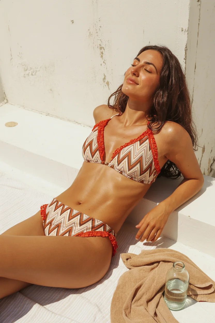
What I like here is how natural it feels. The tones are grounded, the design isn’t overly busy, and the overall look fits perfectly into relaxed, slower moments.
Graphic Prints and Sculpted Strapless Confidence
Strapless designs require careful construction, which is why I pay close attention to how they’re made. When done right, they create a clean, sculpted shape that feels very intentional.
Adding a graphic print gives movement to the design without disrupting the structure. It’s a combination I’ve seen work well for clients who want something bold but still refined.
Tropical Cut-Outs and That Confident Getaway Energy
This is where things become a bit more expressive. Tropical prints combined with cut-out details create a strong visual impact, but when the design is balanced, it still feels wearable.
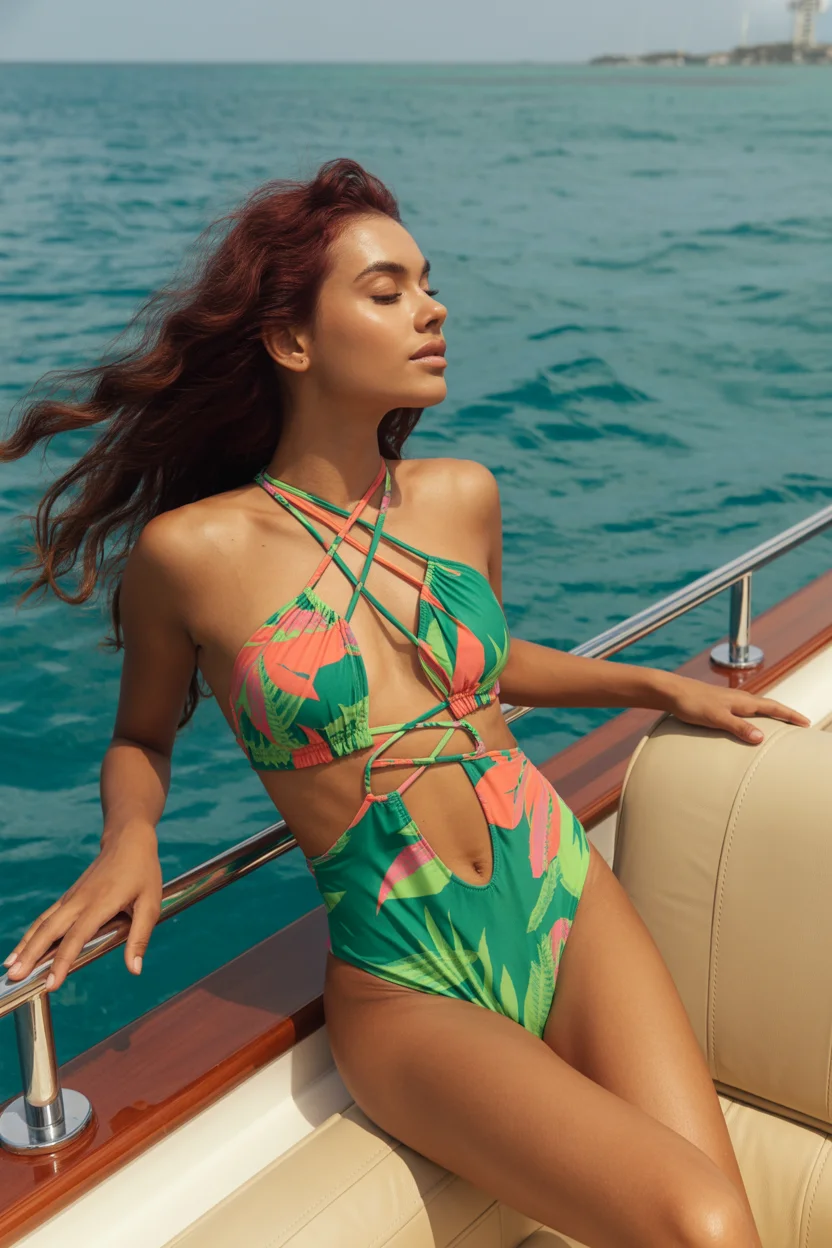
I always look at how the elements interact—the print, the straps, the shape. When they align properly, the piece almost styles itself. You don’t need much else to complete the look.
Polka Dots, Sarongs, and That Effortless Beach Walk
I often tell my clients that one good layering piece can transform everything. A sarong does exactly that. It adds movement and makes the outfit feel complete without adding weight.
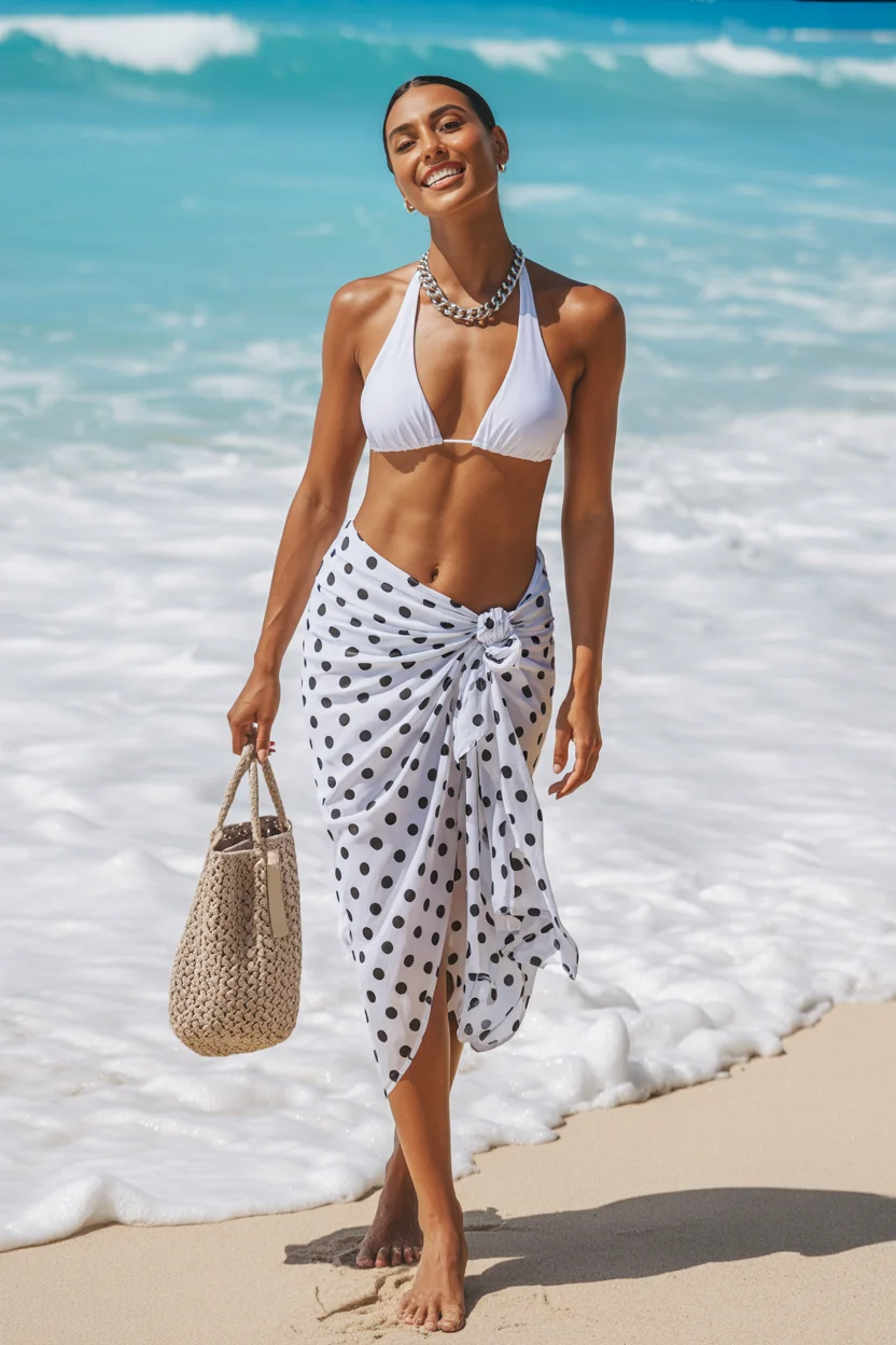
Paired with a simple bikini, it creates a relaxed yet styled appearance. It’s practical, easy to adjust, and works well beyond the beach itself.
Neutral Sculpting and Elevated Coastal Minimalism
Neutral tones have a quiet strength that I’ve come to appreciate more over time. When combined with subtle cut-outs and textured layers, they create a refined, cohesive look.
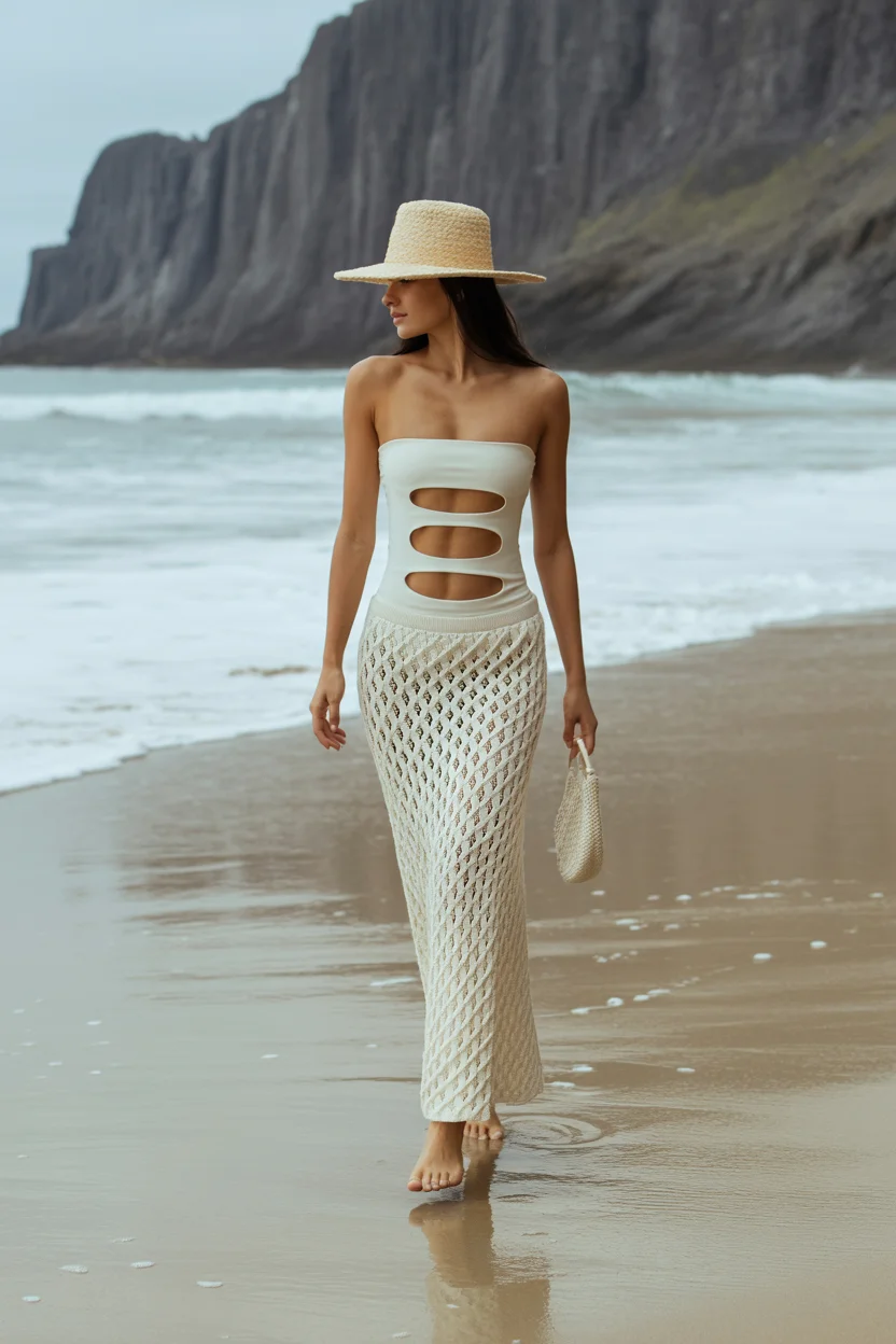
This kind of styling focuses on restraint. Nothing feels excessive, but every element has a purpose. It’s calm, balanced, and very intentional.
Animal Print Reinvented in Soft Desert Tones
Animal prints have evolved quite a bit, and I’ve noticed a shift toward softer, more wearable versions. Muted tones make the pattern feel less aggressive and more integrated into the overall look.
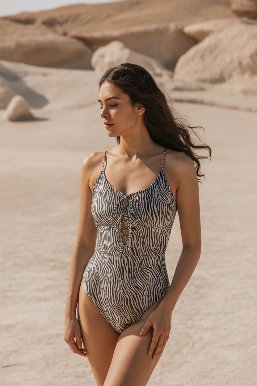
The silhouette remains simple, which allows the print to stand out without overwhelming the design. It’s a more subtle way to incorporate something bold.
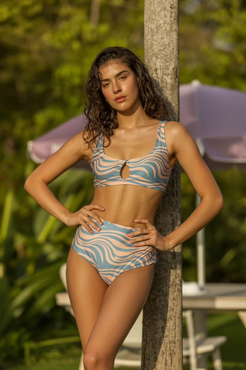
Minimal Zebra Lines and Barely-There Styling
When you strip a print back to its essentials, it takes on a completely different feel. A minimal zebra pattern on a lightweight bikini feels clean and almost effortless.
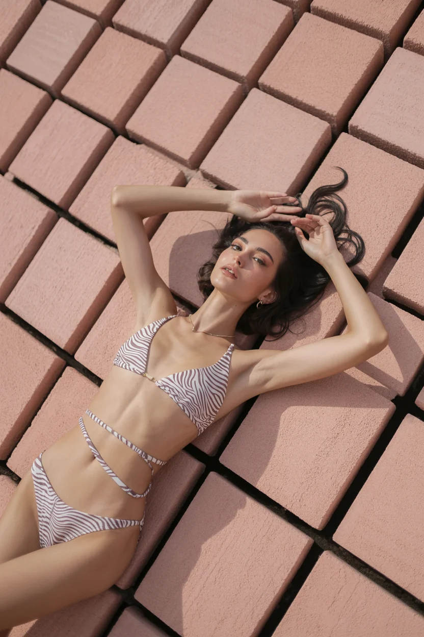
I find that this kind of design works best when everything else is kept simple. The lighter structure, the reduced detailing—it all contributes to a look that feels easy, modern, and quietly confident.